Friday 5 July 2013

Web Animation Screencast Blog

Since beginning our web animation project, I have begun to assemble a presentation about the uses of web animation and the way in which it is applied on the web. For a change, instead of writing about my findings, I have decided to present them in the form of a screencast - as well as some pre-production material. The Screencast is as follows:

And for part two:

Now that the pre-production phase is complete, it is time to begin the production process. The following screencast takes place at a point half way through the animating process - and I will talk you through the techniques used.


After the somewhat lengthly production process, the animation was completed to what I hope is a high and near professional standard. A .MPEG2 version of my completed animation will be available below - with the addition of audio.


Subsequently, I have evaluated my product in the form of yet another screencast. I discuss the strengths, weaknesses and improvements that could be implemented into the production. The screencast is as follows:


Now that the production and evaluation are complete, I will continue to explore more ideas with regards to the future of web animation projects; having enjoyed this project, I would love to continue creating additional web animation projects for fun!

Monday 10 June 2013

Uses Of Web Animation

In modern times, the use of animation on the internet has a huge range of uses ranging from advertising,  gaming, interactive elements or information. I will discuss a few of these uses in more detail below:

Banner Ads:

Often found on consumer websites, animated web banners can be used to either advertise or to entertain. Due to the fact that advertisement companies want to transmit a positive and professional image about themselves, most banners of this type will be exported in .SWF format due to its high quality and low compression. In fact, most .SWF files are vector-based so can be viewed at any size and on any screen.

Animated banners can be optimised to interest and entertain users in order to effectively advertise products. However, many animated banners have earned the reputation of being irritating or annoying to users who are simply trying to access a website for informational purposes - and do not want the hassle of dealing with tiring advertisements. Therefore, it is obvious that these advertisements should be used in moderation so that they do not hamper the website completely.

When on the subject of banner ads, most people will assume that such animations involve the traditional  moving elements such as people or flames. However, most advertisement companies utilise the ability to animate by cramming many adverts into one. As you can see by the following example, there is no traditional animation that you would normally expect. Instead, the animation has been configured to simply flick from one image to another. From a financial side, this method is excellent since four advertisements are in the space of one and as a result, advertisement companies could theoretically make four times as much profit with their promotions. Although, from a creative point of view, this appears to be an easy option or a 'copout'. Without having to animate individual elements of the image, this method of animated banner is quick and easy and, unfortunately, seems to be the type of advert resented by so many internet users due to its sole purpose of pointless advertising. On the flip side, this does have some creative elements. For example, if a user is uninterested in a traditional web animation, the advert is useless. With this method, if a user is equally bored by an advert, another set of adverts will always follow - one of which may grab their attention.

Alternatively, the banner on the left is very different to the one above. Instead, this banner consists of only one promotional advertisement. This time, elements within the advert are advertised - such as the eye patch and the bats appearing. Although the animation here is not particularly impressive, it is an improvement on the previous one and is, instead, more visually pleasing. On the plus side, the fact that this advert contains very little animation means that the file size can be reduced dramatically which, in turn, reduces the loading time of the advertisement.

These animated banners are often specific to the website. For example, on a computing website, banners may feature special offers for new laptops of computers. This is because such advertisements are more likely to interest the audience which are likely to be visiting the page.


Animated Interface Elements:

Animated interface Elements can be found on websites in the form of rollover buttons, interactive videos or game elements. Typically, such elements transform when clicked on or move when rolled over. This can enhance a website - especially if it is for children - by making the experience more interesting for them.

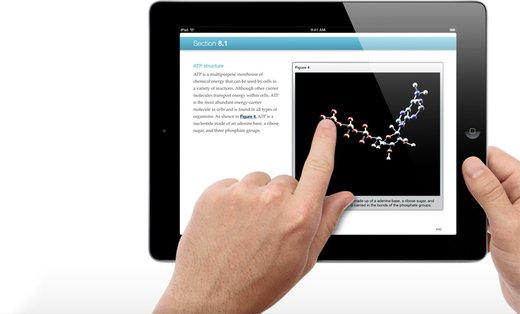
Another use for animated interface elements is the ability to enlarge or shrink elements on a website in an attempt to make it more interactive. As you can see by the image on the right, these elements are more effective on a touch screen device or tablet but can also work well on traditional computers with the use of the mouse. If a website contains features such as these, they are often viewed as more modern or even more compatible with various other devices. Unfortunately, to optimise such features, websites using them will need to be based entirely on flash (swf) which is excellent but means that page file sizes are greater which increases loading time or wastes valuable data allowance on mobile devices.

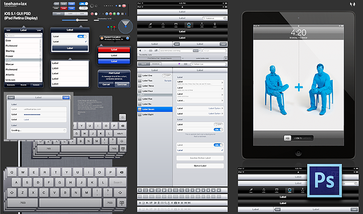
As you can see by the collection of images on the left, animated interface elements can be used with animated keyboards, drop-down menus and pop ups. Such elements can make a website feel more alive - as apposed to being a static page with no movement. However, in my opinion, too many animated interface elements can make the page too busy or confusing and decrease creative value of the page.

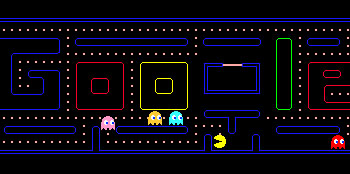
A key example of interactive interface elements is provided by Google.co.uk. On special occasions such as famous birthdays or anniversaries, Google transform the loco on their home page into a peice of innovative artwork - often consisting of some interactive interface elements. Most memorably, Google transformed their homepage to feature a mini 'Pacman' game - for pacman's 30th anniversary in 2010. Based on the origonal google logo, this allowed users to play the classic arcade game directly from the google homepage.

Clearly, novelties such as these will add huge entertainment values onto the Google search engine but, in addition, such concepts provide massive promotional benefits to Google - which is probably why they have earned the title of the No.1 search engine worldwide! Therefore, it is plain to see that such creative additions to the website really do make a difference to the number of website visits and as a result, can make Google a lot of profit. Interestingly, Google has around 900,000,000 monthly visitors while Bing, at No.2 has only 165,000,000 monthly visitors - which is hugely less! Incredibly, with the addition of the Pacman element for just one day, Google saw their daily visitors increase by 50% for the following week simply as a result of this innovative variation to the google website.

A key advantage of marketing techniques like this one is that, should you not be interested by such novelties, the Google search engine loses no functionality as a result of them. Instead, the search engine works as normal meaning that people can still use it as a traditional search engine. However, on other websites, developers use interactive interface elements which, while very interesting, pop up in the center of the screen and thus, impeding the functionality of the website. This could be a key reason as to why Google has be come so popular!


Linear and Interactive Animations:

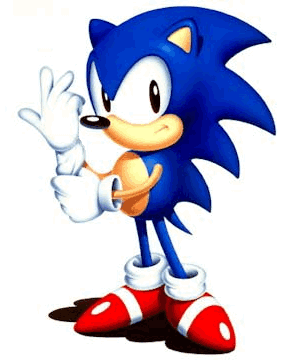
Linear animations are perhaps the most simple form of animation found online. Such animations are pre-scripted and often loop continuously with the same motion - such as the example banners above. These animations do not change over time and tend to be for more entertainment purposes and are not particularly interactive. As you can see on the left, the image of sonic consists of a constant movement with no variation: regardless of any attempted user input. This is why it is called 'linear'; the animation follows a direct route or 'line' without any diversions and once started, continues to the end of the animation.

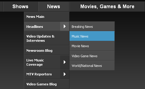
With interactive animations, the opposite applies. Instead of being completely pre scripted, parts of the animation can be influenced by the user and can occur as a result of the user's actions. These can range from elements as simple as a 'play' button on a video through to a small flash game. In addition, these animations can be in the form of drop down menus or rollover buttons - normally created on programs such as flash, fireworks or swish. As you can see by the image on the right, this drop-down menu has many drop-down elements and is fairly complex. This works well since the information is hidden when not needed although, it can be a nightmare if trying to find a specific piece of information quickly. Therefore, a compromise is reached between the amount of hidden information and permanently visible information to get a nice balance of both convenience and visuals.

Instructional:

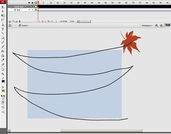
Especially on 'how to' websites, instructional animations can be a simple yet effective way of demonstrating a skill or technique in a way that is easy to follow and comprehend. As you can see by the animation on the left, the linear animation demonstrates the skill quickly and repetitively. The advantage with this is that no information needs to be read and for visual learners, instructional animations are the simple answer. In addition, this alternative means that large amounts of space are saved with this small image instead of a large paragraph of confusing text. Although in this animation, the motion is rough and not smooth, many instructional animations can be made to look professional and smooth -  with a little extra time and effort!

While this particular animation is fit for it's purpose, it is pixelated and not particularly appealing to look at - given the rather hand drawn style. However, the image on the left is far better - it shows the situation the way it really is on the computer and all motion is smooth with a relatively high frame rate. Personally, I feel that this type of animation is more appealing although the simplicity of the first animation is definitely a positive point.

Unfortunately, this type of animation does not appeal to everyone; some people like to read/hear the instructions instead of watching them. Unfortunately, with an animated gif like this one, the addition of audio is impossible. However, with the use of .SWF files from flash, audio can easily by superimposed onto the animation if necessary.

Flick Books:

Flick books are interesting devices that, although are almost never used in industry, can be created in the home as a easy method of animating small objects such as balls or people. The principle of flip books is that on each page, a slightly different image will be drawn in the sequence. Then, when the image sequence has finished being drawn, the pages are flicked through in quick succession to give the illusion of animation.

In terms of advantages, flip books are easy to create and are relatively effective when finished. Also, they can be made by children of any age and can be as simple or as complex as necessary.

However, flip books have many disadvantages - which is why they are not used in industry. Firstly, animations in excess of say, 50, frames are impossible due to the fact that there are simply too many pages to flick through and getting a notebook of that size can be difficult. In addition, frame skipping is easy since there is no systematic way of transitioning from frame to frame. Similarly, frame rate is hard to regulate and could change throughout the animation - which is not ideal for industry use. Lastly, there are simply more efficient ways to create animation in the modern day than to use flip books. For example, to get such animations on the internet would require every frame to be individually scanned into the computer and then animated again. Since the images need to be re-animated on the computer anyway, using the flick book is completely unnecessary since cell animation would be an easier alternative.


History of Animation:

Clearly, an awful lot of development in the animation industry was necessary before the likes of digital animation online that we are used to today. Some of the first instances of animation were seen around 1829 with the invention of devices such as the Phenakistoscope and the ZoeTrope. Although very simple, these devices provided the first instances of linear animation in a fairly effective way.

Such devices work using the principle of 'persistence of vision'. This is the idea that when a sequence of slightly varying images are displayed one at a time in quick sucession and, as a result, the images appear to move. Clearly, in reality, these images are completely static but, due to delay in the human brain, the mind is forced into beleiving that the motion really exists without effort. Unfortunately, there is a threshold as to how low the frame rate can be pushed - (the frame rate is the rate at which each image transitions to the next). In modern times, an absolute minimum of 24 frames per second is acceptable for animation - which is why the image above appears to have stiff and unrealistic motion.

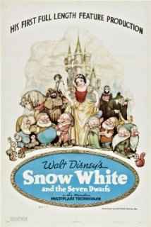
The next major milestone with animation occurred in the late 1930's when walt disney created the first feature-length animated film: Snow White and the Seven Dwarfs. Using cell animation, this film transformed the 'Disney' company into a huge media empire - which still thrives today - all from a result of this film.
Cell animation is a form of stop-frame animation which as invented by Earl Hurd and John Bray in 1915. The idea of cell animation is an ingenious one - and allows someone to create more lengthly pieces without needing to individually draw each frame - as was with the Phenakistoscope.

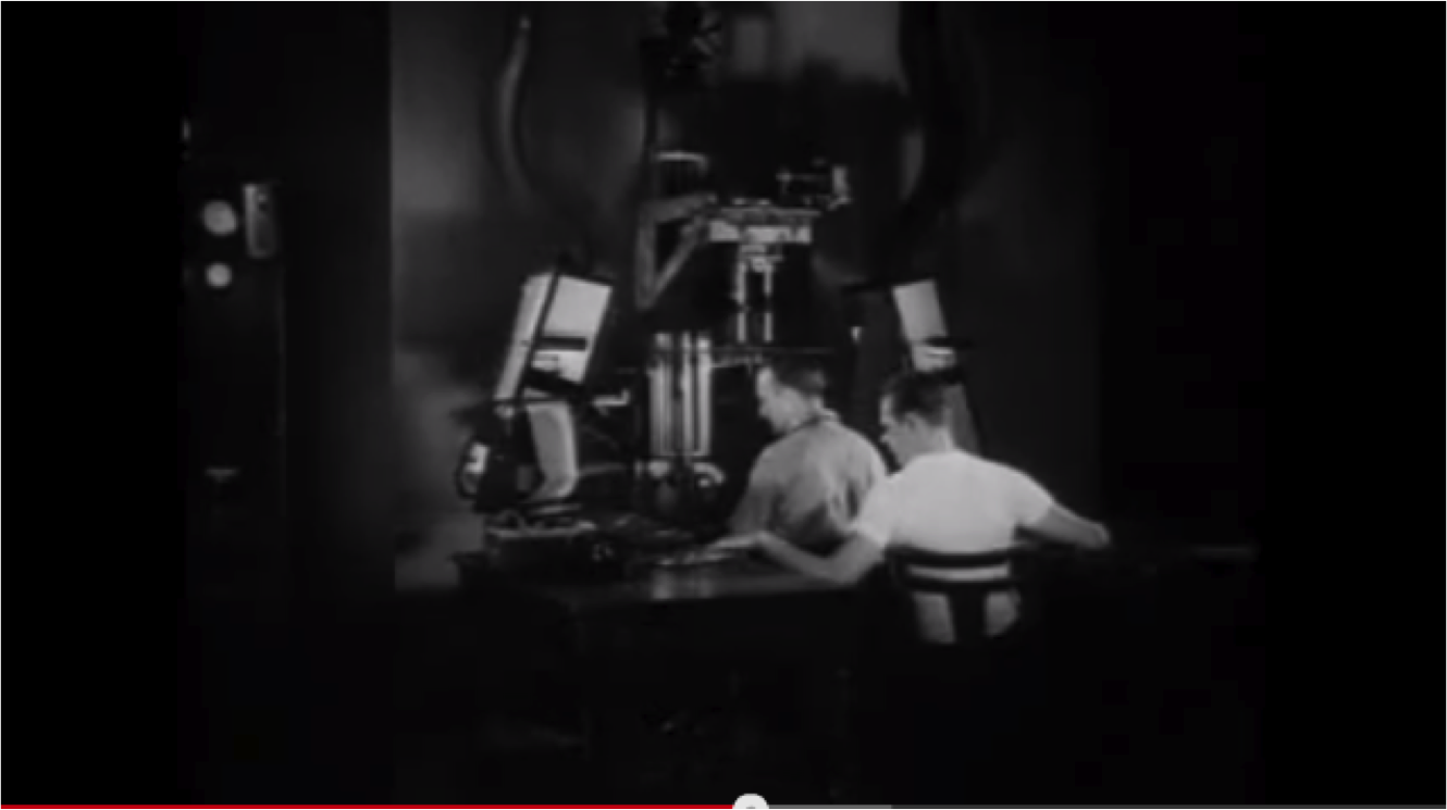
Cell animation works with layering. To begin with, an artist will paint a detailed background for the scene which would be secured at the back of the image. Then, on a piece of transparent laminate, extra pieces such as buildings and trees would be overlaid onto the background. Now, providing that there is some distance between these two layers, the layers can be photographed repeatedly and animated without the need to re-draw each element. The device above is what is used to superimpose and then photograph each layer. A third layer is then added which contains characters or other moving implements which, again, move independently from the background. Fortunately, it is only this layer which needs to be constantly re-drawn for each frame. While this still takes some time, an awful lot of time is saved using this process as well as continuity being easily maintained among separate frames.

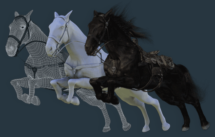
The most modern form of animation utilises the use of the computer: computer generated imagery or (CGI) Is the reason for most modern animated films. Programs such as 'blender' or '3DS max' can be used to construct three dimensional worlds made of polygons. With modern CGI, the quality is increased by increasing the number and decreasing the size of each polygon - giving a more realistic effect. With CGI, any frame rate can be used and, in some games, frame rates in excess of 150fps can be seen. As you can see on the right, the image shows the creation of a CGI horse. On the far left, only the polygons exist - without skin. The image in the centre shows how the object looks with the addition of 'skin' - this converts the network of polygons into what appears to be one solid object. The final image on the right shows the addition of textures, hair and accessories - all of which can easily be animated with the use of   keyframes. CGI was brought to life with the first ever CGI feature film: Toy Story.

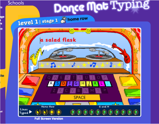
DHTML stands for Dynamic hypertext markup language which, in simple terms, allows a web author to add interactive animated elements that would normally be difficult to achieve on regular HTML. Clearly, DHTML has very little use out of the internet world but is a technique often employed by the BBC on their website - like in their touch typing course for children.

DHTML can be used to animate text or images as well as being able to add effects to elements in the webpage. The key advantage of this is that websites can be made more engaging for the younger community - lots of moving elements can be inspiring for young users as they learn about the use of computers on the internet. However, since adults are generally not as dependant on large amounts of animated content as children are, DHTML is not always necessary. Instead, regular HTML is sufficient with simple java or flash applets embedded into the page.

Techniques In Computer Animating:

As mentioned above, the secret to a professional animation lies in the frame rate. In cell animation, a minimum of 24 fps is used to achieve the persistence of vision effect. If this target is not met, the animation is liable to look jolty and unprofessional. The same goes for digital animation on the computer. However, using computer animation makes this task an awful lot easier. Since cell animation optimises stop-frame animation; each frame is individually animated by the animator. Computer generated animation gives you the option to create key-frame animations with the use of motion tweens.

Motion tweens allow you to select two vector points in the space and assign a specific object to those two points. Then, without any external input from the user, the computer automatically animates the object between the two points. As you can imagine, this technique dramatically speeds up the animating process. This advantage means that almost anybody can easily create smooth animations - with a high frame-rate - in minutes. The disadvantage with motion tweens is that many people let the computer do all the work with the use of tweens and as a result, these animations become less creative; objects move in perfectly straight lines without looking natural and realistic. This is where computerised stop frame animation comes back into use.

With the use of onion skinning, creating stop frames on the computer has many advantages over animating hand drawn images. Onion allows the author to see previous frames of the animation with the use of a transparent p
review. This means that you are always able to see the previous frame so that you can make an accurate judgement as to where the object should be placed on subsequent frames. This is just another method of ensuring smooth and professional animation without using a motion tween. As implied earlier, stop-frame animation is the better form of animation due to complete user control over every single object. However, the key disadvantage - as implied earlier - are time constraints. Especially with longer animations, stop-frame animations can be extremely time consuming - especially if you are searching for a quick and simple method of animation.

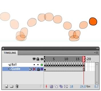
As you can see by the image on the left, using flash, the ball can be animated easily since you are able to see previous frames at any time. Another advantage with onion skinning is that you can change the speed at which objects appear to move and give the illusion of acceleration or deceleration. Although it seems self explanatory, the further the object from it's onion skin on the previous frame, the fast the object appears to move. You can see this by the diagram above. At the bottom of each parabola,  the balls are closer together since they are moving more slowly. However, at the top of the parabola, the images are further apart to give the illusion of speed. While it is possible, this effect is harder to achieve with keyframe animation and motion tweens due to lack of user control.

In my opinion, whilst this is not the easy option, I prefer stop-frame animation to keyframe animation due to the reasons above. However, I realise that both have their pros and cons and both are widely used on the internet due to their many advantages over each other.

Exporting Digital Animation:

Since all internet animation must be digital, there are many decisions to make regarding your export settings when creating web animation. These settings will have direct effects on the scalability (the ability to resize without losing quality), compression and file formats. In addition, all of these decisions will also have direct impacts on their download speeds and loading times - both of which need to be kept low in order to fit into the modern world.

For optimum scalability, vector animations are the answer. With relatively small file sizes, .SWF and .FLA files use such vector animations but must be embedded onto websites using flash applets. In order to view such animations, the user must have the correct 'adobe flash' drivers to view them. While most users do, it must be considered that some do not and as a result, not everybody will be able to successfully view the animation.

To avoid these issues, exporting as a .GIF or .MNG will be a solution; Windows and Mac OS both have the sufficient default drivers to read such files without the addition of external drivers. However, .GIF files have very limited scalability when enlarged and can very easily appear pixellated on web pages. This is because .GIF and .MNG files do not use vector graphics and, instead, are exported with a finite number of pixels in the image - this is called a raster image. In addition, such images are often compressed upon export to reduce file size - this can have significant impacts on the image quality when viewed at larger sizes. Above, a classical example of a pixelated image is shown. Clearly, it is easy to deduce that such quality is not sufficient for any modern website and should be avoided - even at the cost of larger file sizes.

In all, a decent file size for any internet file in recent times should be a maximum of around 500kb (0.5mb) - This will ensure the efficient loading time of webpages without keeping users waiting.

Choosing a program for web animation:

As you can imagine, there are a huge range of animation soft-wares available - all of which are capable of giving similar results as the final product. Therefore, it is essential that you are able to differentiate between discrete programs in order to decide which one will work best for you. Cost, program features, compatibility and export options are all factors that should be considered when choosing an animation software.

Perhaps the most well known, adobe flash is a modern and professional software for not only animation; gaming, rollover buttons and animated interface elements can all be constructed within flash - which is one of it's key advantages. Adobe flash, priced at £450, is one of the most expensive animation software on the market. However, given is huge amount of features, excellent compatibility and professional feel, this price is more than justified. Compatible with both PC and Mac, almost anyone can run the program on their computer. Given the price of £450, this infers that the program is aimed towards more professional use - and less towards the amateur community. This means that we can expect great things from the program before even using it and, upon using the program for a few years, the software is not a let-down. In terms of layout, those who are familiar with traditional adobe software will feel instantly at home when using flash: with the timeline at the bottom, work space in the center and tool bars either side, flash is easy to get used to for new users as you can see above.
In terms of features, stop frame and key-frame animation are both very easy to achieve along with simple drawing tools, motion tweens and a huge array of exporting options. In fact, a rare and excellent advantage of using flash is the ability to completely re-arrange the work space as seen above. For example, should you want the timeline at the top, work space at the bottom and tool bars on the left - dragging and dropping means that you can very easily change the layout to suite your creative needs. In fact, the only down side does seem to be the price. In summary, the program is efficient, refined, professional and easy to learn - with practice. In my opinion, if not for the price, this software would dominate the market for animation programs and would probably wipe most other programs off the board!

Another software commonly used for animation is called 'Toon Boom Studio'. Costing around £190, this program is considerably cheaper than adobe's Flash. Despite higher value for money than flash, it appears to be lacking slightly in areas such as tools available and combustibility. Non the less, stop-frame and key-frame animation are still easily possible in the program with very little fuss. Another advantage of Toon Boom Studio over adobe Flash is the ease of use: at a very basic level, BTS can be used by almost anyone and on any computer. As you can see by the grooves on each toolbar, the layout is still highly customization but, in comparison to flash, the toolbars here are appear to be far shorter as a result of far fewer tools and options. While this benefits the ease of use, it steers the program away from a professional level and appears to be aimed more towards amateurs.

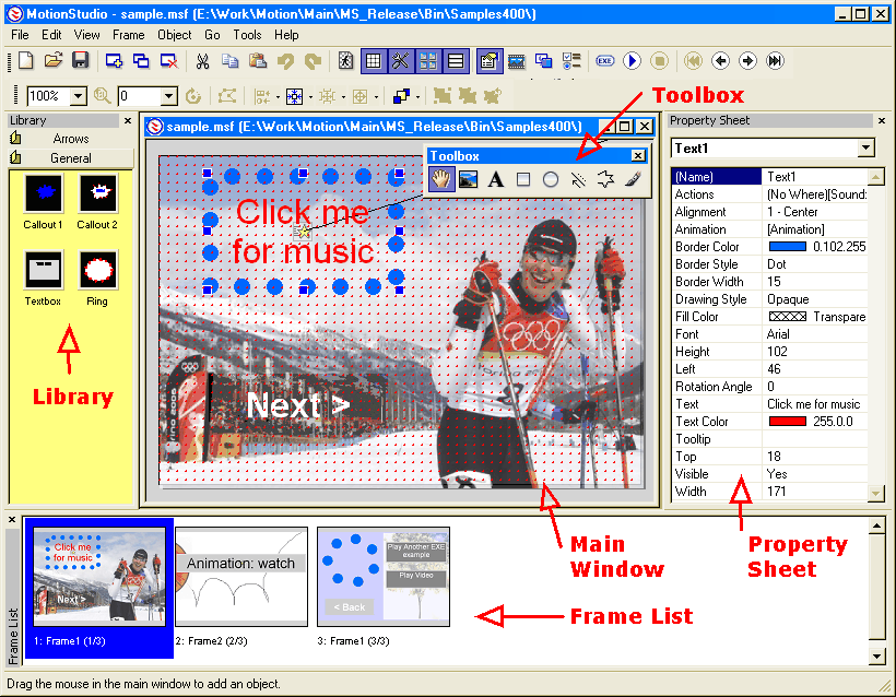
Finally, another alternative is called Motion studio. Costing only £25, this is the cheapest of the three software reviewed here. Although this price appears reasonable, the cause of the low price is immediately apparent. Firstly, Motion Studio is only compatible with windows PCs meaning that Mac users have no way of using the software. However, since Windows is the most popular operating system, this is not too bigger problem. Strangely, the program only allows exporting to .EXE files - this renders web animation impossible and limits the program only to things such as presentations or animated films only to be viewed on the computer. This is a significant disadvantage which, from a creative point of view, is ridiculous to attempt to work with. As you can see from the screenshot, the layout is confusing with no sign of traditional features such as a timeline or drawing tools and, as a result, I found that the software was very impractical and irritating to use. Being badly tested and buggy, the software crashes often meaning that work is often lost  or corrupted which seriously impedes the creative process. With no option for stop frame animation, you are restricted to motion tweens which consist of stiff motion, low frame rates and only 16 bit colour. In summary, the price of £25, while being low, is far too much to pay for a software of this type: even if it was free, I would still expect more! However, on a very basic level, this program is a cheap way to learn animation basics while for professionals, this is certainly not an option.

Tuesday 14 May 2013

Evaluating Sporting Websites!

Since completing the creation of my digital graphics, it's time to see how they all fit together, as one, in a webpage! However, to make this look as realistic and professional as possible, it stands to reason that I should research some existing websites with relation to their digital graphics design but more importantly: the layout!

To begin, with the first of the three websites, I decided to evaluate "http://www.yardbarker.com" which is a popular sporting website specialising in sports rumours, gossip, opinions and humour. Since, according to ebizmba.com, this appears to be a popular website - I decided that it would be an ideal place to start when searching for websites on which to base my own!

From looking, it is possible to tell that this website is designed for a slightly older audience than that of "BA sports" and as a result, many fonts and styles may be different. For example, the fonts are fairly basic and do not attract the user's attention as much as "Apple Boy BTN" however, this creative decision is reasonable, considering the older target audience that I predict this website is for!

As you can see by the screenshot of their homepage, YardBarker have little or no web banner. Instead, they have a large graphic of the title of their website. While this is not the technique I will be adopting, it is worth noting that this is a popular design decision and should be remembered for future projects - if necessary. Interestingly though, this banner/title is offset to the left side of the screen, giving what I think is a modern and professional feel.

With YardBarker, their navigational/rollover bar is, as you would expect, placed horizontally towards to the top of the screen. It is worth noting that this website does not contain the equally popular vertical navigational bar. In terms of rollover behaviour, the YardBarker ones are relatively basic and simply turn red when rolled over. While my rollover buttons are somewhat more complex, I don't feel that they are over the top and fit my target audience as intended.

Interestingly, this website does not seem to feature any dynamic logo. This could be because they want the focus of their website to be it's content: the sport. Therefore, logos and web banners may dominate too much of the user's attention and as a result, I understand why such elements have been missed out.

Unfortunately, the website's backgrounds are fairly minimal and are simply a white background with a black border. However, I do like the simplicity of this background - partly for the same reasons as above, but also because the use of black and white in the colour scheme seems very modern and professional. However, this has little relevance to our project since our colour scheme is quite vastly different.

In terms of general layout, the website gives the impression that it has been designed with a similar layout to that in a newspaper. For example, the text is arranged into short columns and is dotted with many pictures to reduce the amount of worded-content. I feel that this layout is excellent for a news-related website and that elements of this style could easily be incorporated into our website to give it a similarly professional vibe.

Secondly, I have decided to look at equally popular "Sky Sports" in order to evaluate the design of this website.

It is noticeable on sky sports that their logo and web banner are more or less the same thing. As you can see, this logo/banner is situated in the same place as in YardBarker and, as expected, it follows the colour scheme of blue and red - which is actually closer to mine than YardBarker.

Interestingly with the navigation bar, when you roll over each button, it is not that button that changes in appearance. Instead, every other button changes to a more faded blue. This is a very interesting technique and is a little more original since it does the same job, but in a slightly different way.

I have also noticed that none of these websites so far have featured animated gifs. Possibly because of the low resolutions and associations with children. However, I feel that animated gifs would fit in perfectly with my website since it is designed predominantly for children.

In terms of layout, this website uses a sidebar of images on the right but, apart from this, no other images are used on the page. This website differs from the last in that the text is horizontal on Sky Sports instead of in vertical columns. This means that more text can fit onto each page although, this means that the text is less interesting but more conventional to look at - in my opinion.

Finally, I decided to review "http://sportsillustrated.cnn.com" which is often abbreviated to simply "SI". If the favourite of the three websites, SI.com is simple yet stylish and uses many of the digital graphics that we have designed for our project.

Contrary to this though, the web banner and loco have, once again, been merged as in sky sports. However, this banner is much less dominant and only takes up a small space in the top left.

The rollover buttons work in exactly the same way as in "YardBarker" does: the text simply turns red. This design seems increasingly popular with websites with this target audience.

This is the first website I have come across that features screen icons. Although these icons are used in a slightly different way than in the way that we planned, this is an excellent example of how icons can be used on websites. The icons are situated towards the bottom of the page and serve as a 'links' section to get to Facebook pages, twitter pages or podcasts etc.

Wednesday 13 March 2013

Factual Radio Production Techniques Reflective Learning Log

Recently, we have begun our next project: Factual Radio Production. We have been fortunate enough to gain the assistance of radio presenter Ed Stag who will use his expertise to guide us through this section of the course. In fact, he has set us a project brief so that we know what we are aiming for for the duration of this unit. Our brief is as follows:
 I'd like to commission a 60 minute (roughly) programme to air on a fictitious radio station, the name of which will be decided by the students. The programme title will also be decided between them.

This 60 minute programme will focus positively on life at Bluecoat Academy as seen by the students who are commissioned to produce the elements being broadcast. It will contain a distinct mix of material which would appeal to students, parents and teachers and will be based primarily in fact. An element of artistic license can be used to achieve a more professional sound, effect or to add drama. The target is to inform, educate and surprise through creative use of audio and treatment.

Each student will be responsible for 7.5 minutes of output and there should be an even spread of subjects creating a cohesive programme flow. There will be guidance on some required elements eg: One ‘calling to account’ interview, events listings, news reports etc and one or more producers may wish to split elements of their output across the whole show.

It’s important that each section represents something of the Producer. There’ll be an element of group working to decide on style and context across the hour plus opportunities for extra input and creativity. We can also take into account future ambitions so that what is taken away may be useful for their careers or at least give a taste of what may be involved.

Potentially, two rounds of commissioning may be necessary. The first will be a pitch of a treatment designed to sell their idea and the second will be a return once any comments have been acted upon.

Despite looking rather wordy here on the blog, it outlines our task and gives us a good idea of what we will be doing. At first glance, I am interested by the fact that "each section represents something of the producer" - this means that we will be able to personalise our project and make it "our own".

In more generalised terms, the brief outlines that we will be collectively devising and creating a 60 minute factual radio broadcast aimed specificly at students, parents and teachers at the Nottingham blue coat school and should have a general slant towards life at the school. More specificly, Ed`s brief says that we will be able to add drama with the use of heavily produced sections of our broadcast - with the use of voice acting and sound effects. This in particular is exciting since it will allow us to be especially creative in our own sections of the broadcast.

In addition, I feel that it is important that we consider the fact that all of our parts will need to fit together into a broadcast as a whole - and therefore, the broadcast will be more professional if our separate parts can link together somehow in order to produce a more wholesome effect.

Working With Ed:

Since we have now spent 4 hours listening to Ed and gaining advise from him, we now have a reasonable feel of what makes a professional but engaging piece of radio. Aside from the technical aspect of radio, we have also learned about what makes an effective piece of journalism. Although this appears fairly simplistic, Ed suggested that we should focus on fulfilling the questions "Who, what, when where and why?" when partaking in journalism since this will give us the best possible coverage of the story.

In our first session with Ed, he showed us how to take simple, maybe boring story and create a treatment with the hope of turning it into an interesting piece of radio. Ed picked the recent story of the Mars expedition and gave us some ideas on how to develop the story, some of his ideas are as follows:

- Fill one minute with pre recorded content including effects and music to grab the audience`s attention.
- Include a vox to gain the opinions of others and to add an additional dimension to the show.
- Ask an interesting question "Who would you not go with?"
- Try to "change gear" to keep your audience interested.

Since working with Ed, I feel that my strengths regarding knowledge of radio production were in the fact that, having listened to a lot of radio, I knew of a few techniques that presenters use to engage and interest their audience and as a result, could relate to Ed`s ideas on that front. However, for a weakness, I feel that my technical knowledge of radio production could be greatly increased with Ed`s expertise in order to expand my understanding of the topic.

Naming Our Station:

As a whole, our group have come up with the name "Blue-Spoke" for our station. While loosely relating the name to "Bluecoat", the name emphasises the element of speech on the station and ultimately provides our audience with some prior knowledge about the show before they really even know what it is. In this light, I feel that the name is short, easy to remember and generally very effective.

In terms of naming the particular show, we reached the conclusion of "60 Minute Mix". Primarily, this name gives a relatively accurate description of the show itself whilst at the same time, grabs the audience`s attention with the use of alliteration - I feel that this point is particularly strong since our show should stick out from the rest.

Mission Statement:

"Our aim is to make a professional, up to date and exciting program that appeals to students, parents and teachers. It will be informative and interesting incorporating our tastes as well as the views and opinions of others."

I feel that this statement correctly sums up our intentions and accurately describes the feel of our show. Perhaps a point not mentioned in our mission statement is the fact that our radio show will be relatively light hearted in order to make for pleasant and relatable listening.

Budget:

Although, in our production, budget is not really a consideration, in professional radio production, each show can turn out to be rather expensive! Since radio stations are funded by the government, recent cuts mean that radio budgets in industry are tighter than before! Therefore, a compromise is required between cost and quality of the show. The budget has impacts on the following implements of radio production:
 - Equipment
- Guest Stars
- Radio Licences

In addition, stations with a net broadcast revenue of between £22,951 and £647,620 pay a royalty rate of 3%. Clearly, this must be considered when planning the radio station since the royalties alone could cost an annual total of £19,428!

According to "www.prsformusic.com", a minimum annual fee for each licensed station is £891 - regardless of size!

In order to attain such a broadcast license, you require permission to use a particular frequency of the radio spectrum. If this permission was not explicitly yours, you run the risk of interference with other broadcasters which could ruin the quality of your broadcasts. However, payment is normally a nominal fee and therefore, once paid, will not become a regular part of radio budgeting.

When setting up even a low cost radio station, the cost of purchasing equipment such as an Audio processor, a transmitter, a mixer, microphones, an antenna and the necessary softwares and computer equipment can be extremely high! According to "Radiobrandy.com",  the cost of equipment alone can be in excess of £5000.

However, once a radio station is established, revenue from advertising can relieve the pressure from such tight budgets. According to "marketingminefield.co.uk", a single radio advertisement from an external business can bring a rough minimum of £1000 per week of income to your radio station. Therefore, if you play a selection consisting of, say, 20 adverts per week, you may gain a comfortable income of at least £20,000 per week on advertisements.

If, like other radio stations, you intend to play music during your show, royalties must be paid in order to gain permission to broadcast such music due to copyright laws. This must be considered as one of the most dynamic costs of the radio industry - according to "wikipedia.org"


Day 1- Pitch to Ed Stagg:

Yesterday, I was given the area of "School Shows" to cover in my section of the overall radio show - 60 Minute Mix. During my section, I have decided to try to raise awareness of the school productions with the aim of increasing popularity; through what I have seen, very few students take the time to watch school plays and I believe that if they were more commonly known, they may be better attended.


Therefore, I decided to generate a simple treatment outlining my 7 minute segment and generally describing the content of each minute respectively. The treatment, as well as my pitch to Ed are as follows:


Pitch Notes:

-     - Nobody knows about the school shows, in my opinion, its a fact.

-      -Clearly, a lot of work goes into the creation of such shows so it would be ideal to use my section of the radio show to interest people in the school shows and to raise their profile.


-      -Therefore, I intend to create a section of the show that will engage, interest and cause enthusiasm among students and parents to increase interest in the school shows.

-      -Firstly, to prove my “accusation”, I plan to vox local students – asking them if they know what the last school play was – they wont.


-      -We could then take the results to the drama department and ask them why they think this is, and what they do to raise their profile.


-      -Mainly documentary style, in one go. We originally placed my section of the show near the middle – I happy with this choice. One chunk
-      Audience will be mainly students and parents – teachers are normally engaged.

-      -On a more positive side, I plan to interview past students who are experienced with school shows and ask them about their experiences

-      -Locations – spend time in drama studio conducting interviews and research

-      -Unique selling point – produce the show in dramatic style

-      -Equipment, zoom mic or portable recording device


Basic Treatment:

-      Start with heavily produced section – edited to engage the audience
-      Introduce the topic, and what were going to ask, then play the vox about whether the students actually know the name of the latest school play
-      Talk to the drama department, why they think students don’t know about their shows and who they target their shows at.
-      Talk to previous students- actors or technical assistants, asking them how the shows work and their experience.

During my production, I aim for there to be a small but visible conflict between views of participants. For example, the drama department may claim that their productions are incredibly well attended. Whilst, at the same time, other students may claim otherwise. Therefore, without even saying anything, this conflict will be evident to viewers and this conflict may only be resolved if students, parents and teachers make an active effort to view the school shows as a result of the 60-Minute-Mix.

Participant Details:

- School students - obtained by roaming the school with sufficient recording equipment.
- Drama Department - obtained by emailing suitable individuals by requesting an interview
- Past-production-students - obtained by emailing suitable individuals, once again.

Since delivering my pitch to Ed, I feel that it went successfully: I personally think that I conveyed my ideas efficiently and as a result, was able to expand on such ideas based on his feedback. For example, he suggested that instead of asking a direct question within my vox, I should ask a more open ended question on order to gain a more generalised response. I feel that this is a reasonable suggestion since this will allow those interviewed to say what they want - as apposed to answering a question that they may not necessarily know the answer to. For next lesson, I will formulate a more detailed plan for my section as well as create emails to invite individuals to speak on the show. In addition, I will create some relevant questions to ask within my vox/interviews which will need to be engineered in a way that will gain the best possible answers.

Day 2 - Planning Continued

I have used todays session to continue to plan my radio show in terms of the initial speech at the begin30ning of the show. This section will introduce themes and issues within the topic and will introduce our audience to our first people interviewed.


Then, the show will continue with a Vox of a focus group asking students about their knowledge of the school shows. the reason I have chosen to include this section here is to maintain balance within the show to give the opinions of students early on so that I can back up my point which is that very few students take an active interest in the school productions. I feel that a Vox will bring variety to the show and will ensure that I include as many different voices as possible throughout my 7 minute section.

Then, to counter the previous section, I will conduct the interview with the arts department so that they can respond to my point and show our audience how they actively encourage students and parents to visit the shows (if this is the case). As it stands, the questions I will ask are as follows:


-       Do you feel that your shows are as well attended, as you would like?
-       What do you do to encourage students, parents and teachers to watch the shows?
-       When creating a new show, what target audience do you aim the show at?
-       Do you feel that this decision reflects the school community?
-       What genres/types of performance do you tend  to lean towards when creating a production?


In terms of the first question, I feel that it is important to find out weather the department agree with my idea that they are not as well attended as they should be. However, if they do not agree, I have ensured that the rest of the questions are totally independent of the answer for question one.

For the penultimate question, I feel that it is worth while finding out weather a good reason for badly attended shows could be due to the fact that younger students or students in general are simply uninterested by the choice of show that is performed. If this is the case, we will need to try and make the choice of show look as interesting and positive as possible in order to boost attendance to the shows among students.

Finally, the last question will give me some ideas of the general choice of show that the school choose. With this information, we will be able base our ideas within those areas in order to theme our radio show accordingly. If we took this a step further, we may be able to tease our audience about future shows that the school will be staging - providing we were able to find the relevant information.

When planning my material, it is important that I consider copyright: If I do use copyrighted material, I should ensure that I log it in a document so that, in the event that it is released publicly, I will be able to gain permission from the publisher to use the clip.


Day 3 - Testing Equipment

As briefly mentioned earlier, we will be using Zoom recorders (mobile devices). Therefore, we used this opportunity to firstly, test the equipment but also to test our interview skills and try to find out what techniques work best for us personally.


Interestingly, due to the fact that the zoom microphones have a front and back microphone, we are able to create a 4-track recording and record the interviewer and the person interviewed cleanly and simultaneously. This will ensure that my recordings will be as professional and high quality as possible and as a result, the radio show will be professional also.

Finally, I have sent an email to Mr Mansell and Mr Collins requesting an interview from them with regards to their school shows. The email is as follows:
Dear Sir,

During my creative media radio production course, I have decided to produce a section of the show relating to the awareness of the school shows through the school. It would be great if I could record an interview with you to gain your thoughts on the subject, what your department does to promote the shows and why your shows are a success.


If this would be possible, please reply to this email with any available time slots you may have inside the following few weeks.


Thank you for your time,
Sam Turner


Hopefully, when both members of staff reply, we will be able to schedule their interviews early next week so I can record a short interview for both people.


ii feel that my strengths lay within setting up the Zoom devices so that they record high quality audio with surround sound so that the sound quality is as high as possible.
In terms of a weakness, I feel that improvement could be made within my interview techniques: I should manipulate my questions in a way that will get the answers that I want from the interview. If I was to do this successfully, the radio show will have more direction and will flow specifically in the way that I want it to.

Day 5:

Today, I have been putting yesterday's interview knowledge into practise. Having devised a set of questions, I have begun to Vox students of the school to ask them of their knowledge of Bluecoat's shows and plays. I have decided to interview as many students as possible in the same room - therefore, the reverberations and background noise will be continuous throughout the Vox. Using the side rooms, as I am, the students may feel more comfortable in a slightly smaller space and therefore will sound more natural on the final broadcast.

in terms of strengths, I feel that my interview questions are consistent throughout interviews and as a result, the vox will sound organised and balanced. Also, this means that we may start to see some trends within the answers as soon as I have completed some more interviews - this will at least give me something to talk about during my section of the show.

In terms of weakness, I feel that I should work on making my interviews more interesting and more comfortable for the people that I am interviewing so that I get the highest quality answers that I possibly can.

Day 6 (Content acquisition):

Since  my last entry, I have been spending time inside the school recording studio recording my two narrations for my radio show. I was recording my introduction as well as a section towards the end. A slight problem I had was that I had to set up the recording system before moving into the recording room. While this worked well, trial and error was required when getting the correct levels for my recording. Clearly, if the levels were too low, the recording would be inaudible and if the levels too high, distortion would occur. However, doing this only took around 5 minutes to perfect and as a result, my production schedule was not hindered.

In addition, I have also interviewed Joshua Wing and Mr Mansell (Head of drama) about their school productions and have some very interesting information with both of them. I ran into a few issues when dealing with the zoom recorders; despite fully charged batteries, the batteries ran down completely after around ten minutes. As a result, my interview with Mr Mansell resulted in using my iPad to record the second half of the interview. While this was an effective solution, the quality of the iPad's recording is slightly inferior to that of the Zoom recorder. However, the audio is still clear and audible and will serve my purpose. To improve next time, I will either bring my own personal batteries or recording equipment so that I do not have to count on unreliable equipment during recording.

on the whole, I feel my strengths were in my interview techniques; I feel that my questions provoked interesting and valid answers during my interviews. With some editing, I feel that shortened versions of my lengthly interviews will prove interesting to listen to for the audience since both interviews include valuable information for parents and students.

as mentioned above, a weakness lies within my relying on equipment that may not perform correctly when called upon. Therefore, this is an area for improvement in the future.

File Storage:


In terms of file storage, I feel that it is important to know what content is within each file - especially when there are many files as there are in my vox! For convenience, I have created a folder for each minute of my production and placed the recorded content into each folder respectively. This will mean that locating the files will be much easier in the editing process and will make the post production process far easier.

For the vox in particular, I found that some of the people I interviewed gave a less relevant or sensible response than others. In order to find the best clips, I have classified each Vox file in terms of the quality of the response:

"H" - High Quality
"M" - Medium Quality
"U" - Unusable or irrelevant quality

For my other files, I feel that relevant naming will be enough to see me through the edit. I feel that such practises are professional and completely necessary in order to ensure that the process is as smooth as possible; sifting through unnamed files can be very time consuming and may result in reduced quality of the final product.

Day 7:


Now that the majority of my recording is complete, It was necessary to spend some time with Ed Stagg in order to gain some feedback on my work and findings. Having taken this tutorial session, I found that it was very useful in order to aid the development of my project and to ensure that it was as professional as possible.

To begin, we found that the first area of improvement was to be found in the introduction; Ed suggested        that it would be beneficial to prove my assumption that only a few students attend the school shows by requesting the show statistics from the school administrators. If this would be possible, then subsequent interviews with Mr Mansell, who claimed that his shows always sold out, would be made more interesting with conflict between stories. An action plan to make this happen consists of two steps:

- Contact school finance department (or an area along those lines) to find statistics
- If my assumption is correct, I must plan a second interview with Mr Mansell in order to give him right of reply.

Secondly, Ed suggested that I should quantify the results of my vox - possibly by giving a percentage of students who said they had never heard of or seen our school shows and, alternatively, give a percentage of those who have. This means that I would be converting my research into solid facts to give a more substantial and accurate report on the situation on my final radio show. In order to succeed in this, I must perform the following steps:

- Count the number of positive/negative vox entries that I have collected and place them into a chart or graph.
- Script a short piece of dialogue for me to read during my radio show in order to report on my findings.
- Record this piece of dialogue whilst in the mean time, remembering to leave space for it inside my edit on cubase.

In terms of strengths in my project so far, Ed commented on my interview skills and that I asked 'good questions' and were able to catch people on their 'back foot' when querying delicate subjects (such as attendance of school shows) For a weakness, Ed suggested that I should limit my conversation fillers (such as 'yeah', 'okay', and 'right') during my interviews so that whoever I am interviewing feels compelled into continuing to talk - and therefore, giving me a more detailed response.

Day 8:

Now that the recording is complete, I am now able to collate my recordings and begin the editing process - using cubase.   

Inside cubase, many different editing tools make it possible to professionally cut and edit sections of audio into manageable sections. The most useful tools to me personally are as follows:

- Arrow Tool: This is the default tool, used for selection, moving and duplicating clips.
- Eraser Tool: Used to erase unwanted clips of audio.
- Scissors: Used to slice single clips into multiple clips so that they can be individually edited.
- Zoom Tool: Used to accurately zoom into sections of the timeline in order to specifically edit pieces of dialogue or music.

When beginning a project, it was rather confusing as to what presets to load. However,  choosing the "Mastering" tab and then selecting "Stereo Mixing" option appeared to be a reasonable choice to use. In fact, this preset automatically opened tools such as the mixer, EQ and reverb - ready to use! This was especially useful to me as these three tools were all ones that I planned to use.

When faced with the blank project, I began by creating three audio tracks. In order to ensure a smooth and comprehensive workflow, I renamed each track "Speech1", "Speech2" and "Music". Hopefully, in the later stages of my production, this system should help to keep the project organised and professional - meaning that changes can easily be made and sections of audio are easy to locate. As well as these advantages, this also means that music levels can be independent of the other tracks, meaning that they can be changed to fit the speech content that will be played over the top.

Now that the project is set up, I am able to begin the actual editing process. By using the folder system that I established during the recording section of the project, I was able to clearly see the content of each minute of my radio show.

Then, by importing the footage a minute at a time, it was possible to cut down each of my recorded sections so that they equal roughly one minute each. Clearly, it is unnecessary to worry about weather each section was the exact planned length. However, if each section strayed too far from the planned length, the final length of the project may be altered.

One of the key problems I encountered was that although interesting, many of the interviews were far too long - some of them even exceeded 7.5 minutes long! Therefore, it was necessary to select key parts from each interview - enough to fill 1-2 minutes. While this solved the timing issue, it was important to ensure that my cuts were natural sounding: a sudden cut is very noticeable and can be distracting to listeners. Clearly, this is something to avoid.

When all the audio was in place, I decided to add some background music to lengthly interviews in order to make them more interesting to the listeners. The strengths of doing this are that it appears to add better pace and atmosphere to the recording to improve the quality of the overall production. However, the weakness is that if the levels are not correct, background music can sound very unprofessional. If it is too loud, it obstructs the speech and it cannot be heard properly. If it is too quiet, it sounds accidental and appears to be simply background noise. Therefore, it is important to get the balance correct.

Now that most of the project has been edited, I have decided to add equalisation (EQ) in order to boost the quality of my recordings. EQ allows you to increase bass, treble or any frequency in-between - independent of each other - this can be seen as the 'colour correction' of audio! However, if EQ levels are too drastically altered, the effect can be rather unnatural or distracting. Although, if changes are subtle and reasonable, these changes can successfully enhance the fi
nal product. For example, due to my voice sounding too deep on the recordings, reducing the bass and increasing the treble can make my voice seem more presentable; I have done this to my project.

When choosing jingles and background music, I tried to match it to my theme: Drama. As a result, much of the music used in my final edited is what is associated with "show business" and old film (Music such as Jazz or Piano music) I feel that this reflects the mood and style of my section of the show - as well as helping the audience to understand the feel of my show.

I feel that during the editing process, I can present narrative simply with the order in which I assemble my audio footage. For example, in the Vox, I can generate a change of tone by presenting all of the negative responses firstly, which will be followed by the positive responses. This should create a "Change of gear" and should help to illustrate the topic with more power. In addition, mixing levels can help to convey meaning. For example, I can mix certain pieces of footage so that their levels are much louder than those in the rest of the project and, providing clipping and distortion is avoided, this can create emphasis.
Before exporting the project, I used Cubase to normalise all of my levels so that all of the pieces of audio have similar levels and for the listener, they wont feel the constant need to adjust their volume control - the audio level will be constant.

On the whole, I feel that my section of the "Sixty-Minute-Mix" has turned out professional and interesting to listen to. Although parts of it are light hearted and informal, I feel that it is still factual and informative to the listeners. In terms of strengths, I feel that my interview questions and editing techniques helped to bring the show together in a way that is easy to listen to and to understand.
However, in terms of weakness, I feel the organisation of my timeline could further be improved so that it is easier to edit, should I need to. Even though the individual tracks are labelled, some pieces of my audio do not fit into either category of "Speech" and "Music". To improve next time, I would possibly create additional tracks to improve my organisation - this should decrease the editing time as well as making the editing process more productive.

In addition, I felt that using cubase did hinder our progress slightly, as a group. Although it is very functional and professional, many glitches make it difficult to use it from day-to-day. For example, lack of synchronisation between the mouse and the timeline made editing frustrating and time consuming - possibly reducing the quality of the final product. Therefore, if I were to repeat the project, I would edit using Adobe Audition - a similar program available in school with the same functions, but slightly useable with the absence of various glitches.

In conclusion, I have  enjoyed the radio project and feel that I have learnt an awful lot regarding the production of professional radio. I would definitely enjoy repeating this project in the future and feel that results would be even better if this was the case! Working with Ed was an invaluable experiance since his expertise made decision making a much less concerning process.

During the project, I particularly enjoyed using the hand-held recording devices. This allowed much more freedom with recording and also allowed me to record in the spur of the moment - as apposed to having to set up the recording studio first.