The BBC is a world wide media company which is funded by tax payers of the UK. The BBC is one of many international companies which have to monitor and maintain many codes and conventions in order to retain consistency throughout the company.
When working for the BBC, specifically in radio, it is good practise to consider the codes and conventions of professional radio production in order to ensure that your production is as accurate, balanced and safe from negative criticism as possible. Clearly, radio has been around for many years and, as a result, many codes and conventions have been confirmed as correct and I will be discussing some of them in this article. Accuracy: Although it seems obvious, being inaccurate can cause inconvenience to listeners and encourage complaints and negative reviews from your listeners. For example, an inaccurate weather report about heavy snow could cause unnecessary concern amongst listeners and could be potentially dangerous if the audience took such reports seriously.
Similarly, inaccurate news reports could cause controversy in factual radio - especially if the names of individuals are quoted incorrectly or if details in the report have not been confirmed. In order to illiminate accuracy errors in this area, it is always necessary to perform adequate research into the topic as well as ensuring all stories and reports are up to date.
On the subject of accuracy, the BBC say that in radio, you are asking the audience to "Trust you and to check that what you're saying is true and that your overall account isn't misleading"(1). As we can see from this quote, inaccuracy could mislead your audience and as a result, breaking their "trust" within you as a radio producer. Remember, if you break your audience's trust, they may be compiled to never trust your information in the future. This could lead to your show gaining a negative reputation among listeners.
In our particular magazine project, we will need to ensure that all of our reports and stories are as accurate as possible in order to avoid confusion and unprofessional practice. Balance:
If you are running a radio show, especially one aimed at a wide range of audiences, it is important that your show has a sense of balance in all areas. More specifically, a balance in choice of music played on the show is an excellent way of engaging the audience and making sure that the show is suited to their age group. If all the music played is in the same style, it may cause certain listeners to feel isolated and uninvolved. Similarly, a balance of different types of news stories can be essential within factual radio programming. For example. if all of your news stories are negative and gloomy, you may set the wrong impression to your audience - causing your show to gain a negative reputation. On the other side, showing too many positive news stories may make the show seem as though it is fabricating stories to hide the truth from the audience. In general, a good balance of all material, presenters and themes will make for an interesting and unique radio show.
Within debates on the radio, balance is especially important in order to maintain a valid and impartial and objective argument. More specific, on political radio shows such as the "Sean Hannity show", balance is even more important to ensure that all parties gain sufficient respect and "air time" in order to ensure that bias is avoided. When we create our show, it will be well worth considering the positive effect of having good balance within the show. For example, a good balance in our show could mean that a wider range of students and teachers could be engaged by the show as it will have areas of interest for everyone! Ensuring that we have good balance will ensure that our show is professional and evenly proportioned.
Impartiality:
According to the BBC, "Impartiality is one of the hallmarks of the BBC's journalism. Impartiality is also a matter of trust"(2). Impartiality consists of a mix of objectivity, balance and neutrality. When creating a radio show for the BBC, it may be easy to "take sides" when discussing a controversial story. However, such practises are biased and may influence the opinion of your audience. Instead, it is necessary to cover both sides of the story and then allow the audience to make up their minds - without trying to force their opinion in any way. In addition, making an impartial judgement on a subject could cause controversy amongst your listeners. Taking this a step further, making false judgements or allegations about certain companies or individuals could land the show in considerable deep water and it could face prosecution.
As a result, it is always necessary to appear open minded on air - even if this is not the case. Ultimately, your job as a producer/presenter is to aid the audience to "make sense of events through disinterested analysis"(3) The word 'disinterested' implies that you should simply channel respective stories or news items directly to your audience without adding additional information or opinion which may effect the way your audience perceive the story.
Impartiality has defined links with objectivity which is defined as "Judgement based on observable phenomena and uninfluenced by emotions or personal prejudices"(4) Therefore, within a BBC radio show, making judgements about a story does not always mean that you are not being impartial. On the contrary, if your judgement is backed up with solely with evidence and with the absence of emotional influence, you may help your audience to make similar judgements if the need should arise. However, care should be taken to avoid being controversial over delicate, political or personal topics.
When on the topic of subjectivity, this can be seen as the opposite of subjectivity. As apposed to using external facts to reach a conclusion, a judgement is made based on your individual opinions and feelings which may, in serious cases, result in a breach of impartiality. In most cases, it is safer to rely on objectivity in order to avoid conflict or argument amongst your audience. In our own project, we will have to ensure that we remain open to discussion and try to keep our opinion from swaying the opinions of other audience members during the show. This will make sure that we are not being biased or discriminative for one party over others. Representation:
According to the A-Z of media and communication, representation is to "Show something in a particular context"(5). In radio, themes and ideas can come across in many different ways depending on how you interpret them. For example, when reporting a news story, you could emphasise certain areas of the text in order represent your style and context of radio show.
In another sense, many BBC presenters appear to use stories that represent their personal opinions. In another sense, use of representation can be used to contextualise themes and ideas in order for your audience to comprehend what is being said.
Representation can be used in the sense of "Symbolising something via a physical demonstration"(6) For example, an instructional broadcast may need to use descriptions and analogies in order to represent what they mean - but in a slightly paraphrased way in order to add extra meaning.
In our own project, we will need to work hard in order to represent our school in a way that we want to. We need to ensure that we leave the correct impressions with our audience towards the end of the show. Access: According to relevant media texts, "Access is the idea that opportunities should be provided for individual members of the public to produce their own programmes or articles for broadcast"(7) Specifically in radio terms, a typical convention is that access can be granted via the medium of call ins to the show. As most will probably know, factual radio call-ins can make radio shows more interesting, diverse or simply more open for discussion. Interestingly, making the show more accessible via the public can encourage a wider range of opinions and ideas when thinking about factual radio. It also provides an additional voice for external listeners to listen to in order to add to the balance of the overall show. In radio, access is normally "Free of editorial interface"(8) which can help to ensure that impartiality is retained throughout the show. Providing access to students and teachers in our show could be a valid dimension to the show. If we devised a way to provide access to such individuals, our show may have much larger appeal and interest for the wider school community. Privacy:
Clearly, one of the BBC's highest priorities is to ensure that privacy of all staff and members of the public is maintained at all times. One of the most obvious conventions is to ensure that no personal details such as phone numbers or full names should be released on air in order to avoid the possibility of subsequent harassment or unwanted contact.
"The law allows people to bring actions for invasion of their privacy, for which the court can award damages. The level of damages is relatively low when compared to damages in libel. The highest recent award was £60,000. However, the legal costs of a case will usually be significantly higher than the damages awarded and are paid by the losing party".(8) As you can see above, the highest award for a breach of privacy was £60,000. Despite this being just a figure, it is a clear representation of just how serious a breach of privacy can be - especially if its your company who has to pay for such awards! In terms of privacy, it is a convention that radio listeners should deserve to feel safe and secure whilst listening to the radio. As a result, radio producers should ensure that any personal information retrieved - normally phone numbers - should be protected in such a way that they are safe from the general public. Since we are based within a school, it is of paramount importance that we take time to ensure that privacy issues are carefully monitored. Due to the fact that the majority of our audience will be under 18 years of age, a problem with privacy among students, or even teachers, could result in serious legal issues if hosted on-line or on the school website. Bias: Bias is the idea of supporting or discussing one side of an argument more than the other. In definitive terms, bias is described as "Prejudice in favour of or against one thing, person or group"(9)
As with most professions, bias can have negative impacts on those receiving your work. Especially in radio, bias has direct ties with subjectivity and balance. In radio, it is the convention that you opinions and feelings should have no influence on your bias over certain subjects. In order to ensure that bias is avoided within a radio broadcast, the correct balance between each side of the argument should be equally distributed in a way that shows both sides of the story in the same light. "As a concept, bias is chiefly applied to those sections of the media which carry serious news stories"(10) As you can see from this quote, it is necessary to take the most care to be aware of the risk of being biased when reporting or discussing those serious news stories. In our project, bias will have to be avoided so that all subjects, year groups, genders and stories can have an equal favour and will gain no emphasis over others. This will help to maintain balance as well as giving an accurate and realistic insight into school life. In conclusion, when we come to create our radio production, it will be completely necessary to incorporate many of these codes and conventions into our work in order to maintain a professional, up to date and engaging piece of radio programming. Bibliography: (1) BBC, 2012, Title: Truth And Accuracy, Available at: http://www.bbc.co.uk/academy/collegeofjournalism/standards/truth-and-accuracy/truth-and-accuracy Accessed 27/2/2013
(2),(3) BBC, 2012, Title: Impartiality, Available at: http://www.bbc.co.uk/academy/collegeofjournalism/standards/impartiality/impartiality Accessed 27/2/2013
(4) Wordnetweb, 2011, Title:Wordnetsearch 3.1, Available at: http://wordnetweb.princeton.edu/perl/webwn?s=objectivity Accesed 26/2/2013
(5),(6),(7),(10) Author: Stuart Price, 1997, Title: the complete A-Z Media & Communication Handbook, GreenGate Publishing services. Pages 198, 198, 3 and 25
(8) BBC, 2012, Title: Law-Privacy, Available at: http://www.bbc.co.uk/academy/collegeofjournalism/law/privacy/law-privacy Accessed 27/2/2013
(9) Google definitions, 2012, Title: Bias definition, Available at: www.google.co.uk search Define:Bias Accessed 27/2/2013
After sending out a short survey about our digital video production, I have now received over 40 results. Below, you will see a short evaluation of each piece of data relating to each question.
Question 1: Please select as many words as you like that reflect the video that you have just seen. In the interest of time, I have grouped responses into positive and negative results so that we can see how they compare. Despite having a high number of negative results, more than 60% of the results are positive. Bearing in mind that people may not have taken the survey as seriously as they should, this is a very satisfying result. Interestingly, 38% found the video funny, 32% found that our video was suitable for all ages and 22% of answers said that the video was informative. (these results are combined since participants could select more than one answer) Question 2: Rate the following question - the video reflects the aims and ethos of the PE department.
As we can see, the vast majority of the results said that interviewees agreed with the question. This is very pleasing since this meets the brief that we were given which stated that our video must reflect the good work and ethos of the PE department. Interestingly, a result that this chart does not show was that 45% of students were unsure about the answer. As a result, I feel that I should have emphasised this idea slightly more in the video to ensure that this message was passed to the audience.
Question 3: Do you feel that the style of the video was relevant to the PE department? Similar to the other results, we can see that around 75% thought that the video was relevant. Despite this result being very pleasing, I feel that I could have made the video more relevant by including more interviews and reducing the amount of "Gerald" content in order to prevent the video from straying from the point. Question 4: Would you agree that the video demonstrates the good work, success and enthusiasm of the PE department? As we can see from this result, more than half of the results agreed with the statement. However, it was strange to see that around 25% had no opinion. As a result, I feel I should have included more footage of the success of the department as well as showing much more of the good work that goes on with the department. However, on the whole, this result was generally very positive and I am pleased with the result. Question 5: If at all, did the video change your opinions about the PE department?
As we can see from this result, the vast majority of those interviewed said that they felt better about the department - which is a fantastic result since this was our main aim in making the video. Also, this result is especially pleasing due to the lack of people who said they had "no opinion". This proves that their minds were clearly made up about this question and that the answer was fairly obvious: and mainly leaned towards a positive answer.
Question 6: Finally, please could you select the words that you now associate with the PE department as a result of this video?
As we can see from this pleasing result, over 80% of our people gave a positive result from this question. As we can see, words such as welcoming, enthusiastic and happy were mostly associated with the department as a result of the video. This is very pleasing since our video has clearly increased the general positive opinion about the department - which was one of our key aims!
Qualitative Research
Since receiving the survey results, myself and Josh took our I-pads and showed our video to a few students via youtube. In terms of our feedback, I received comments such as "The special effects were very professional". In addition, adults we interviewed said that "it put a smile on their face" despite some of the childish humour. This means that we have hit our target of making the video suit all age groups - not just one particular age range.
When all footage has been shot and stored, it is then necessary to enter what is called the Post production stage. This stage involves the editing of clips, the addition of extra audio and visual effects. It also involves sifting through footage to find out what footage will be retained and which will be discarded in order to ensure that there are no additional files to sift through which may waste time and effort having to deal with at a later time.
When editing with adobe premiere, the following keywords are necessary to consider when editing a motion picture. I will provide explanations for each.
Before beginning to import files, I feel that it is important to organise and rename files accordingly in order to avoid confusion. For example, I like to create folders containing clips from each scene which are each numbered. Then it is possible to create a bin within the editing software in order to easily edit the footage without confusion.
Workspace:
Not to be taken literally, the workspace is the area in which the user will edit their footage. Being entirely customisable, the workspace refers to the layout of the editing software such as the preview window, the timeline, the project bin and the effects panel. Despite being able to freely drag the separate windows around the program, it is also possible to select presets which are optimised for specific uses such as audio, colour correction, editing, effects and metalogging. Personally, I use the "editing" workspace since it is relatively default and contains all the windows and options that I want it to. More specifically, different tabs and windows have different functions and uses:
- Timeline - this is where the edited footage appears when cut to shape in the preview window. Then, using the tools available, the footage can be tweaked and edited to a greater extent. This is also where the audio and effects can be accessed. - Effects - this is where the audio and video effects and transitions are found and can be searched for ready to be dragged into the timeline.
-Effect controls - this is where the specific effects can be set or changed - normally away from the default. For example, if a brightness effect was dragged to the timeline, the effect controls tab can be used to vary the level of brightness on the clip at a specific level.
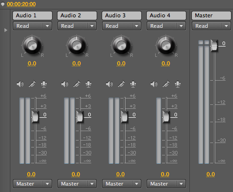
- Audio Mixer - in this tab, there are adjustable levels which correspond to the different audio tracks found on the timeline. When editing, peaks should arrive at around -6db in order to get audio which is not distorted. If audio peaks at 0db when unedited, the audio is then unusable and needs to be re-recorded.
For my particular project, I will be using the basic 'editing' layout since it is simple and easy to use. In addition, it is an excellent layout since all the vital functions and facilities in premiere are available.
Creating a new project: When creating a new project, the "New project" window appears. Despite all these settings being safely default, it is possible to change the video/audio display format (Video can be shown in minutes and seconds OR frames) Audio can be displayed in small audio samples or in milliseconds. I personally use both depending on the different types of project I am editing. We also get a choice of Capture format which can be set to DV or HDV. Again, I like to use both options. However, HDV tends to be a more lossy format meaning that in professional projects, DV is more useful. This window is where the project name can be defined.
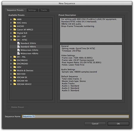
On the next window, a series of presets are available. All of these are very important and very different in their own ways. In the past, I have experimented with almost all of these formats in order to find the best ones. However, the 'best ones' are defined by what the user is trying to achieve. For example, for editing standard definition footage, one of the presets under the "DV - Pal" would be a good choice since that is the default for TV in this country. For high definition, AVCHD, HDV or DVCPROHD can be used to gain professional results. Aside from these presets, users can set resolutions and frame rates to their specification. Personally, I tend to use the "settings" tab in order to construct my own presets ready to use to my specification.
Here, you can choose audio sample rate, resolution, editing mode, frame rate, bit depth and aspect ratio.
Importing:
Importing footage into the timeline is very simple - so long as all of the footage is shot with the same camera (which is why I chose to shoot this project with the same AVCHD camera) This is because all of the footage is the same resolution, bit-rate and frame-rate. This means that the project will look continuous in the final export. Simply drag audio/video items into the bin in order to start editing them. Premiere will then conform the audio files and store these temporary files into "C/Users/Username/Appdata/Roaming/Adobe/Common files. When editing is finished, it is always necessary to have access to these files ready for deletion. Otherwise, computers using Premiere will be very slow and frustrating to use - due to the huge amount of storage these files displace.
When importing footage shot on different cameras, it is necessary to enter the "Interpret footage" dialogue in order to conform the aspect ratio, resolution and frame rates to fit the best quality footage. Despite this creating a quality gradient between different pieces of footage. However, the footage will be the same size and frame-rate - meaning that the final export will look, at the very least, acceptable.
Editing Clips:
As you can see by the image, premiere features a toolbar containing the different ways to trim and edit pieces of footage. Most importantly, the razor tool and rate stretch tool are my preferred tools to use when editing. While both are fairly self explanatory by their names, other tools include the track select, ripple edit, rolling edit, slip tool, slide tool and pen tool. Interestingly, the ripple and rolling editing tools are more useful when editing larger projects. For example, if two pieces of continuous footage are placed together, ripple edit tool can be used to shorten one whilst lengthening the other while maintaining the same total duration of both clips. This is excellent since it does not interrupt subsequent footage and makes editing far quicker. Another interesting tool is the ability to delete empty space. This means that gaps between footage can be removed easily.
The Razor Function: In my opinion, the razor function is the most useful tool available. This lets you create a cut at any point along the timeline and effectively can split one clip into two shorter clips. Then, these smaller sections can be moved, clipped, changed to a different track or have effects added to them. The rate stretch tool: Ideal for fast and slow motion, the rate stretch tool is ideal for shortening and lengthening clips by virtue of their speeds. For example, if a clip needed to be lengthened to fit a larger space on the timeline, the frame rate can be reduced, making the clip last longer but being in slow motion. The roll edit function: On larger projects, the roll edit function can move the edit point between two clips. Effectively, this shortens one clip and lengthens the other without changing their mean overall length: the rest of the timeline is not effected by this editing technique.
Editing to match audio:
Sometimes, it is necessary to fit footage to audio. This technique is best explained through example. In a scenario where an ambient soundtrack suddenly plays an explosion, and your filmed footage has a similar visual explosion. By marking the specific moment of the explosion in both the audio and video tracks, it is possible to match both tracks to that moment in order to unite the audio and visuals to give the illusion of them working together.
Hopefully, in our project, we will be using this technique to match our event audio to different footage in the interest of audio continuity. When filming, we purposely captured 2-3 minutes of audio at the start at each shoot so that this audio could be used throughout the clip. The advantage of this is that no audio cuts can be detected by the audience and, if necessary, additional audio can still be added into separate tracks if needed. Therefore, in this project, this technique will be used greatly.
Continuity:
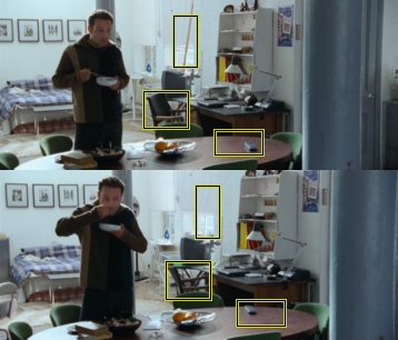
In order for edited footage to look professional, continuity must be considered. Continuity is key to make any piece of footage look professional and friendly and easy to watch. An example of a continuity error can occur when cutting between any two pieces of footage. For example, if the subject was holding its hand in the air in the first shot and, in the second shot, the same hand was immediately back down on his lap, this is considered a continuity error; the transition was not a smooth one. To avoid such errors, the editor should wait until the subject moves their hand back onto their lap before they make the cut.
However, continuity errors can happen in more subtle ways: if the subject is holding a glass in their left hand for the first shot and, for the second, if the subject is then holding the same glass in their right hand - without a logical transition, this is also considered a continuity error.
The key difference between these two errors is that the first can be corrected during editing. However, the second cannot be rectified during the edit if the production process has already concluded.
In our video, continuity will need to be checked multiple times in order to ensure that the footage is continuous and flowing. I will have to ensure that I review all of my edits to ensure that errors in audio and video continuity are avoided if possible and evaluated if not.
Colour Correction:
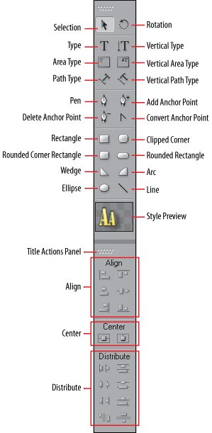
Adobe premiere offers many different colour correction tools. Ranging from brightness and contrast to the three way colour corrector, all of them can be used to tweak the mood, change the look and alter the feeling of many shots. For example, low saturation can give the effect of an action movie: very few colours are allowed to be seen making the footage appear gloomy. Alternatively, high saturation increases the colours seen on the screen which makes the footage very emphasised and larger than life. All of these options are under the 'colour correction' category inside premiere's effects panel.
Split into three sections, colour correction can change the shadows, highlights and outlines. Using similar colour choices in these three catagories is normally the most effective: a technique that I plan to use extensively throughout my post production. I think that this is incredibly effective since setting the correct colours can set the mood very effectivly for the footage.
Titles:
In digital video, there are two main types of titles: static titles and rolling titles. As the name suggests, static titles remain on the same position on the screen without changing position. In a documentary style video like ours, static titles are useful for subtitles or to display the names of those interviewed. They are effective since they do not change position and therefore, are easy to read. Unfortunately, static titles are less useful for large amounts of text due to the fact that it would either dominate too much space on the screen or alternatively, be too small to read. In our project, static titles will be useful in the ways described above since we have one or two interviews that we wish to include.
As for rolling titles, they do not remain in the same position for their duration on screen. Instead, they can scroll vertically or horizontally. For example, for news broadcasts, rolling titles often scroll horizontally across the bottom of the screen. Similarly, for film credits, it is the convention that rolling titles can be seen scrolling from bottom to top in order to display the large amount of names. Contrary to to static titles, rolling titles are ideal for large amounts of text since only a small amount of text is displayed at any one time. However, the downside is that if the text scrolls too fast, it can be distracting or, even worse, be illegible. Although, at a moderate speed, rolling titles will be very effective. In our project, we plan to include a small credits roll at the end in order to optimise the use of both static and rolling titles.
File Storage
Before any stage of post production is begun, it is vital that a proper file storage system is implemented. Otherwise, files may become lost or simply become too hard to find in larger projects. Therefore, it is absolutely necessary to give each media file a relevant name and sort each piece of data into separate folders for respective scenes. Despite not always being necessary for smaller projects, it is good practice to always use such systems to avoid confusion when conducting larger projects.
Since these measures are in the interest of saving time during post production, I personally feel that some of these practices waste more time than they save. Since all of our scenes consist of no more than ten clips each, it is perfectly sufficient to simply arrange files into respective folders and look at their thumbnails as opposed to file names. This will save time and be much more convenient when editing since you are able to see what you want instead of having to read a file name and associate it with what was filmed in the shot. However, I do realise that in larger projects, naming files as well as organising them is absolutely necessary.
Narrative Flow:
In film making, especially story telling, narrative flow is extremely important when maintaining a clear concise story. However, there are many many aspects that can have an impact on the narrative flow of a project. For example, a continuity error like the ones mentioned above could confuse the audience. Or, simply just noticing continuity errors could bring the audience out of the story and make the story less believable. Similarly, lack of explanation for key themes in a story could have a serious impact on narrative flow; the audience may not understand what is going on.
However, at a higher level, narrative flow can be achieved by leaving subtle hints to the audience about what is going on. Firstly, using pathetic falicy in scenes can give the audience an idea as to what is going on. For example, if there was rain outside in a particular scene, this will imply that there is negativity occurring on-screen.
Secondly, narrative flow can be achieved through means of cinematography. More specificity, broadcasting lots of reds on screen could symbolise danger or tension whereas broadcasting blues and greens could alternatively symbolise peacefulness and safety. Using these techniques is more useful in dramatic film sequences as opposed to documentaries such as the project we are doing- however, it is useful to consider using these techniques if the possibility arises.
Finally, use of lighting can also have an impact on the narrative flow. For example, using backlit scenes could help to tell the audience which characters are negative in the story due to the number of shadows this technique would cast on both the character`s face and the surrounding area. However, using lighting positioned rather low down and in front of the character will reduce shadows and imply that they are a more "pure" character within the story. Once again, these are not always worth considering with projects of this style, but, in the future, such ideas would be very valuable when telling a story!
Transitions:
When editing in adobe premier, it can sometimes be beneficial to use transitions in order to make cuts seem smoother or more interesting. Such transitions can be found within the effects tap of the adobe tool bar. Transitions include, cross fade, random bars, barn doors and many other interesting transitions. However, in the present day, it is considered unprofessional to use many of these transitions without a valid reason. As a result of this, a cross fade or straight cut is all that is necessary for cutting scenes.
Alternatively, to emphasise the beginning or end of a scene, it can sometimes be effective to fade in our out from black or white in order to show that the section of film has ended. This can be useful to avoid abrupt endings or to gently ease the audience away from a particular theme into another.
Similarly, audio transitions do occur but are far more limited; normally fades and cross fades are often the only ones used and mainly operate simultaneously beside a video track.
Most transitions can be dragged into the timeline from the effects tab where they can be more precisely configured for professional use. In the same way, transitions can be removed by simply selecting the implement and hitting delete on the keyboard.
Effects:
When editing with adobe premier, adding effects can sometimes contribute to the effectiveness of a piece of footage. Weather this is done with colour correction, cropping or special effects, it is clear that there are a wide range of different effects to use on your project. Effects can be found under the "effects" tab and are categorised.
Taking a closer look, effects under the stylise category aim to stylishly manipulate footage in some way or another. For example, lens flares, mosaic effects, or distortion.
For another category, the "keying" category can be used to mask in our out certain sections of the image. For example, colour key can be used to mask out areas of a certain colour whilst "luma" key effects can be used to mask certain colour shades and temperatures.
Effects can come in many different forms and in many different ways. However, similar to transitions, some should be avoided. Although, it is always fairly easy to tell weather an effect looks professional or not: if it positively influences the scene to increase effectiveness or audience engagement, then it should be retained. However, if it adds unnecessary confusion or annoyance, then it should be removed in order to gain a high quality piece of digital media.
Most effects can be dragged into the timeline from the effects tab where they can be more precisely configured for professional use: values can be changed manually or certain presets are sometimes readily available for download or instant use. In the same way, effects can be removed by simply selecting the implement and hitting delete on the keyboard.
In our project, our effects will mainly consist of colour correction. However, I may use certain slow motion effects such as "strobe light" in order to enhance the comic aspect of our short film. However, effects can play a larger part in different projects - sometimes totally different to this! Still image sequences:
Sometimes, when editing, it can be interesting to convert your footage into a still image sequence. This can be done by choosing the "export frame" option in premiere or after effects. Alternately, you can obtain such still images from other sources such as a webcam or online. Then, by deleting certain frames, you can make your sequence look more choppy, unnatural or stylised. Similar effects can also be achieved by altering the frame rates when the files are re-imported back into the editing medium.
Another way you could use still image sequences could be to shoot each frame as a separate image and animate actors or inanimate objects in a way that makes them appear lifelike.
In another circumstance, still image sequences could be as little as a slideshow of photographs put to music. All of these options depend on the type of project you are conducting and some may not be relevant to particular projects.
Especially for our project, which is based on live action, still image sequences may look out of place in our documentary style video and as a result, we will not be using them for these purposes. However, it is worth bearing them in mind for future projects where their relevance may increase.
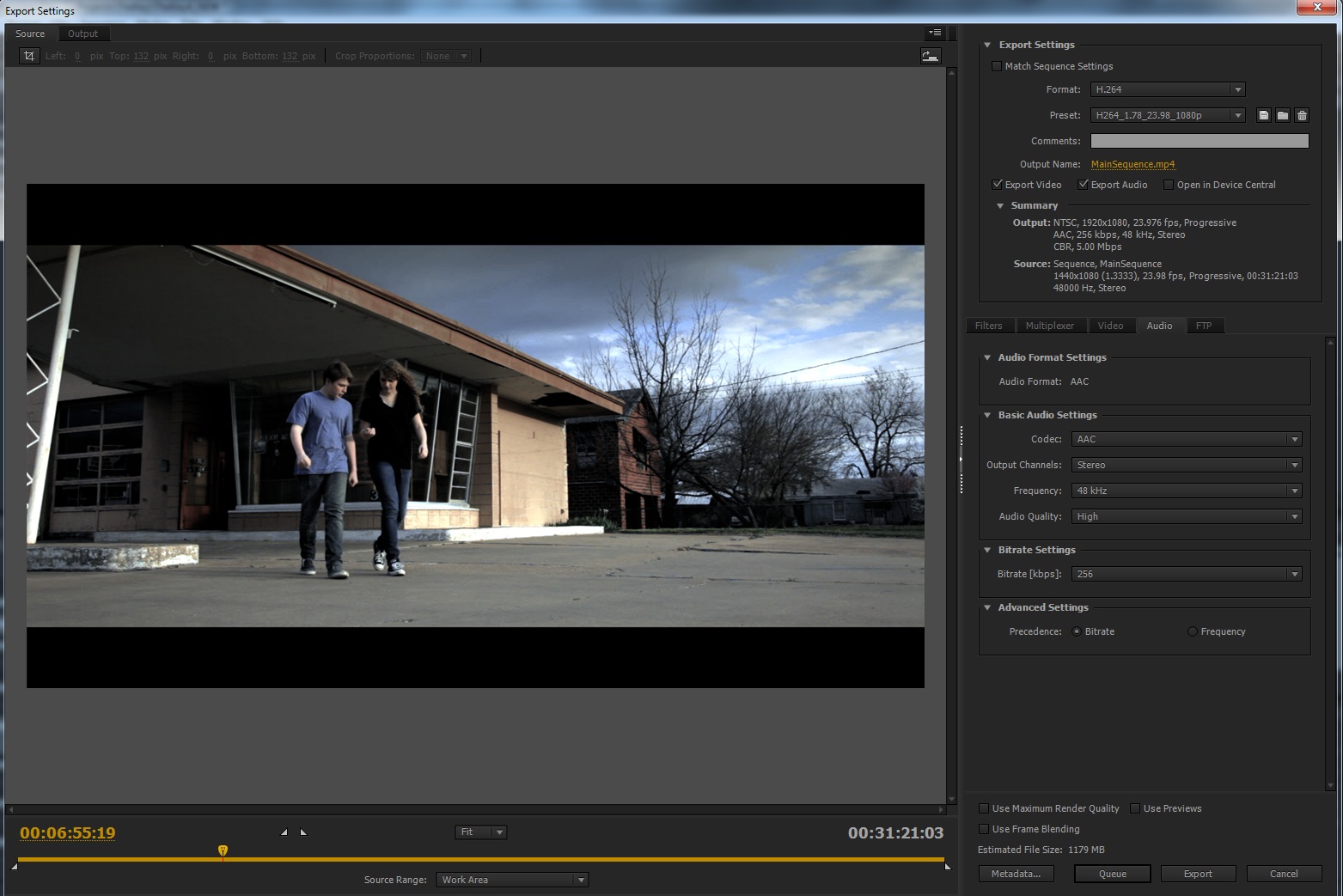
Exporting: Exporting options within premiere are immense: ranging from high definition to standard definition inside a multitude of different formats. As mentioned in previous posts, different file formats can have different uses. However, for this project, we plan to be using high quality settings which will make for a high quality media project. More specificity, I normally use MPEG-II formats with a 1080p (non interlaced) resolution. While retaining quality, this file format is ideal for online use due to its slightly reduced file size which is the product of slight compression.
In the majority of media productions, pre production is an essential and complex task which must be undertaken to ensure that the production process is a smooth and structured as possible which planned in such a way that every aspect of the production process is accounted for and planned for.
In our particular digital video production, we aim to create an interesting promotional video for our school`s PE department which shows all the "good work" that goes on in their department, as well as their continuation of the "Olympic legacy" and showing their ethos.
In this post, I will be covering all of the following:
- Finance
- Time-scale
- Personnel
- Facilities
- Materials
- Contributors
- Locations
- Codes of Practice
Clearly, each of these aspects are completely essential to every media production and, through the duration of this post, I specificly describe how.
Finance:
Clearly, finance is a key element to any good video production. In the industry, simple tasks such as using cameras, visiting locations and hiring equipment require some sort of cost.
In addition, hiring actors and personnel can be an expensive process and is rarely free. Actors must be booked in advance and a price is normally agreed priar to the shooting. Therefore, in the industry, it is important a shooting schedule has been assembled in order to correctly plan the hours of each required actor. Therefore, it is possible to optimise their use to ensure that they are not being payed for wasted time.
Similarly, crew members such as directors, cameramen and produces all require a pre-determined salary so similar planning elements are also necessary to cater for their financial needs.
Luckily, in our particular production, we have all the equipment and locations we need which, in addition happen to be free for us to use. This is excellent since we have very little budget to spend. Fortunately, since the majority of our production will be filmed in a documentary style, no actors will need to be hired and myself and Josh will be taking the place of any crew members required. Clearly, myself and Josh will be working for free and, as a result, the cost of personnel appears to be more or less insignificant.
Time Scale:
With almost any project, a suitable time-scale is completely necessary in order to conduct a well managed project.
Unlike the finance category time management is completely relevant to our project since our project has a definitive deadline.
In the industry, time management is important since it allows each person involved in the project to know where they need to be, what they need to be doing and when they need to do it. Similarly, each project within the industry will always have a deadline. As a result, if these deadlines are missed, serious consequences may follow - such as the loss of occupations or maybe the forfeit of the entire project. Although, with effective time management, such as a Gantt chart, deadlines cannot fail to be met assuming that each member of the team is fully informed as to the schedule.
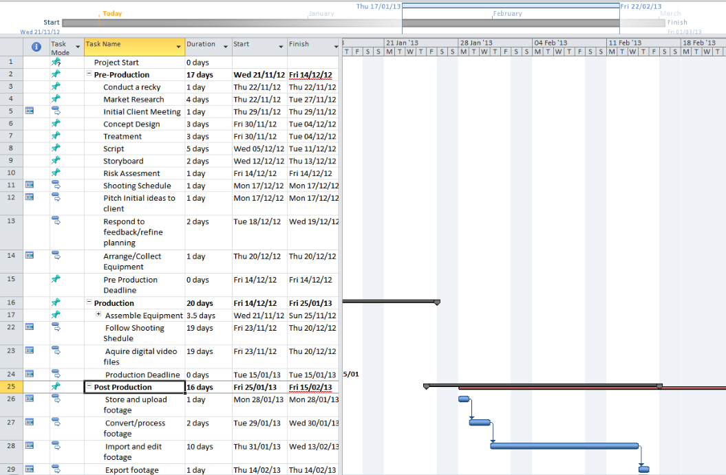
Echoing the above, myself and Josh have created our own Gantt chart, which can be seen in the image on the left. More specifically, a Gantt chart provides users with timings, dates, descriptions and schedules.
The key advantage with using a Gantt chart comes into play when managing larger projects. These projects, with potentially hundreds of tasks, are impossible to memorize. Therefore, having a computer manage all of these tasks, no pieces of work can be forgotten and each task can have sufficient time dedicated to it in order for it to be of high quality.
In our project, the three main phases of our project our pre production, production and post production. Clearly, we are in the pre production process at present and are scheduled to finish this phase ready for 14/12/2012. Similarly, the production stage is scheduled to be completed by 25/1/2012 (excluding the Christmas holidays) and post production will be completed by 12/2/2012 according to our Gantt chart Personnel
Again, no project can be attempted with nobody to participate in it. Especially when looking at TV/Film credits, it becomes more and more apparent just how many personnel are required to create a high quality media product. Just a few of these roles are listed above:
Clearly, in our project, roles such as "special effects co-ordinator" and "producer" are simply not compulsory in a project of this size. However, in a large scale project (such as that seen on the TV), I realise that these roles are more relevant since the deadlines are tighter and the productions are on higher scales with higher budgets.
However, in our project, it is important that we credit the correct people in the credits of our video. Despite having no director, overseer e.t.c, we will still feature contributors and other personnel who must be credited. In the light of this, I have devised a list of individuals who I foresee being listed on the credits:
- Director
-Cameraman
-Interviewees
- Contributors
In our project, we are aiming our project to be a dramatised documentary style video. As a result, we will require volunteers to interview who have knowledge about our PE department. These may involve students or even members of the actual department. Expanding on these ideas, we may include other school members (such as teachers/governors) to gain their input and find what they feel the PE department has achieved from the outside.
Finally, as mentioned above, we require no other personnel other than ourselves to conduct the actual production of the video since we already have the necessary skills required to produce the video. Namely, we already have the skills to direct, edit and co-ordinate the project without needing to hire additional external personnel.
Finally, I will detail some of the key roles and what they entail:
- The Director:
The director will oversee the entire project. It is the director`s job to manage the budget, hire additional personel, design the shooting schedule and oversee the key processes of the project. Similar to a producer, the director will manage the majority of the tasks. However, the producer will manage the sub-tasks and ensure that everything runs smoothly through the production process.
- The Cameraman
The cameraman will take instructions from the director or producer and control the camera. In the modern world, cameras are rather complicated and need to be managed at all times since they are now much much more than simply focus and zoom; cameras have the addition of shutter speed, white balance, storage, quality, resolution of aspect ratio.
- Editor
The editor`s key role is to edit and render low quality previews of the edited project and sit with the director to refine their work. After many months of tweaking and changing, the editor will then render and export a high quality final version of the production ready for broadcast on to DVD`s, cinema, television or internet.
Facilities:
In our own production, we are incredibly fortunate in the fact that we are filming the vast majority of our video within the school premises. Therefore, scouting and booking filming locations will be an incredibly simple task since we are only a few minutes walk from any place in the school. However, if our client requires us to visit football matches/sporting events, then suitable planning for this will be required so that we can place such events onto our Gantt chart.
In addition, our school has all the necessary editing software computers for us to use. As a result, gaining access to such facilities requires little more than a simple request to our course tutors.
However, in the industry, accommodation locations, editing suites and auditoriums must all be pre-booked and paid for in order to secure a place there. In addition, certain locations must be checked in terms of confidentiality - such as a personnel`s home.
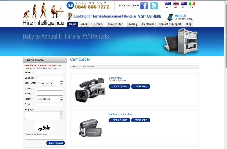
As you can see above, I have listed any equipment/facilities that I can imagine we will use. Aside from the obvious choices such as football pitches and cameras, I have also included items such as stock audio and lighting since permissions and bookings are required in order to use such assets in the project.
Materials:
In our project, as I have touched on, we require the use of stock audio and stock footage. In terms of stock footage, we can acquire this from our client - since he will have filmed/acquired this footage himself. However, when selecting stock audio, it is important that copy rite is considered.
When we select our music/sound effects, we must ensure that each clip is royalty free. This means that once we have either payed for or downloaded the clip for free, we can use it was we wish without having to pay "royalties" every time we use the clip. This is a major caution since our video will end up on the internet. Therefore, if our music was not royalty free, we would have to pay a set amount of money for each view the clip received. Clearly, with potentially hundreds of views, this could be catastrophic for a low budget production.
For any other pieces of media, sufficient permissions must be obtained to ensure the formalities are strictly above board and legal.
However, in the industry, the rules and regulations for stock footage and audio are much tighter. Therefore, each piece of media must be credited and sourced in order to leave no loose ends. However, professional, high budget productions need not worry about "royalties" and, as a result, their restrictions are far less apparent since they have the budget to buy permissions to use certain pieces of music/ sound effect/ clip.
Content can be sourced from two main sources:
- Filmed or recorded by your own production team
- Filmed or recorded by another production team
Both of these sources are effective but content can be more personal to your own project if you source it from your own production team. However, providing copy rite is accounted for, footage or audio can be sourced from external production teams which have higher budget for more detailed or impressive shots. It is also far cheaper to source your own material since royalties cannot apply to footage you have created yourself.
For the purposes of this particular project, we plan to source 90% of our footage through our own means (e.g filming and recording our own clips) However, our client does require us to use some pre-recorded content. We will have to asses such content to ensure that copy rite allows us to make use of the clips provided, and providing this is the case, we will use the clips and, of course, give credit where it is due.
Contributors:
I have already covered the majority of this section, but in recap, our external contributors will include volunteers to interview who have knowledge about our PE department. These may involve students or even members of the actual department. Expanding on these ideas, we may include other school members (such as teachers/governors) to gain their input and find what they feel the PE department has achieved from the outside.
We will also require the permissions of any other personnel who appear in the video to ensure that we are allowed to upload the video onto the web once the project has concluded.
Locations:
In film productions, it is important to consider locations. This is because the choice of location directly effects the aesthetics of the respective video. In order to optimise the use of locations, it is important to go on a reconnaissance in order to recognise effective locations and which will be suitable and which ones are not.
In addition to this, it is important that we scout each location for a risk assesment to ensure the safety of all of those involved with the project. This includes the following.
- Protection of equipment against the elements.
- Possible hazards for team members
If safety was not assessed prior to the shooting, then serious harm may befall crew members which may even lead to the termination of the project. Therefore, by taking specific steps to avoid such risks - such as avoiding or removing the hazards in some way, can save time and stress when undertaking the filming process.
In addition, it is important to consider particular characteristics of a location. For example, the colours that are visible to the camera, the background audio which will be recorded, the "peak" times of the location (when it is busy/when it is quiet) and the customisability of the area for the shoot. Since we are shooting for a real life situation, we will need to capture the imagery/audio as it appears. However, we can still consider what colours are in shot and where to place the camera from location to location to create an exciting digital video.
In addition, privacy must be respected when choosing a location; filming near someone's personal property could cause problems later down the line. In order to ensure that this is not a problem, it is necessaries to either seek permission to shoot there or to find a more suitable location where such limitations do not exist. However, for our project, this should not be such a problem; once we have the school`s permission, we can film in almost every location available in the school premises.
In the industry, insurance and licenses are necessary to cover any injuries or mishaps. However, since we are in a school environment, all insurances are already in place and licenses do not apply.
Codes of Practice and Regulations: As with most things, rules and regulations often apply when creating media content. In order to find these rules, there are a series of websites which specialise in each aspect of regulations. For example, regulatory bodies exist for Advertising standards, Press complaints, Software Publishers, Game developers but most importantly: World Wide web consortium, Ofcom and British Board of Film Classification.
World Wide Web Consortium
The world wide web consortium is an organisation who advise content creators on what they should or shouldn't put on the internet. Their website quotes: "The World Wide Web Consortium (W3C) is an international community that develops open standards to ensure the long-term growth of the Web. " However, it must be remembered that there are no "set" rules for the internet since it is owned by nobody. The internet is built around the fact that computers around the world are able to link with each other to form the world wide web. In short, ANYTHING can be placed on the internet - and with no regulation. However, the standards set by W3C (World Wide Web consortium) are merely a guidance as to what is acceptable. Therefore, when we create our videos, it is worth looking at what their guidelines are simply to ensure that our work is acceptable and will be well received by the public. British Board of Film Classification The British Board of Film Classification (BBFC) are the people responsible for the ratings you will see on films and TV programs. For example, 15, U and 12 ratings are all set by the BBFC so that viewers can have an insight as to the suitability of the film. However, only films of the highest amount of malevolence are banned completely for viewing. For the most part, disturbing films are normally rated 15 or 18. However, since we are not making a film, the BBFC has little relevance to our project other than the fact that we could refer to their guidelines if we were aiming to make our digital video match the "U" rating - since our video will be aimed at all age groups. Office of Communications (OfCom) On visiting the OfCom website, I gather that they specialise in ensuring the quality of digital communication among the residents of the UK. In addition to regulating quality of signals and airwaves, they also specialise in ensuring residents are protected from scams or any other unpleasantness generated by the internet or elsewhere.
Today, we have began to draft a suitable email to send to our client requesting an initial meeting to discuss their initial ideas. When writing the email, we needed to keep in mind that we must remain professional and sensible in our writing as well as successfully getting our point across. Here is the email that we sent:
Dear Mr Hutchinson,
I am writing to inform you about the first stages of
our project and what they entail.
As you may know, Myself and Joshua Wing
have been assigned to your PE department project with the intention of re branding the department through the medium of an interactive media platform.
With the news of this exciting development, we are both eager to schedule a
meeting with you to discuss the following elements of our digital graphics and
digital video sections:
- Project time frame
- The End
products required by yourself
In more detail, our meeting will be to
discuss deadlines and release dates as well as specific content that you would
like to appear within the final product. As a result of this meeting, we will
take forward your ideas in order to create sketch ideas, design ideas and
initial designs for the first instance of the project relating to the digital
graphics for the department.
In addition, we would like to discuss our
digital video production unit; we feel that some sort of digital video would be
an excellent way to demonstrate your ethos and to promote your ideas. Therefore,
our designs and ideas can also be discussed at this time as well as the digital
graphics.
We will mainly aspects of digital graphics such as backgrounds,
logos, colour schemes, images and animations. In addition, we will be carrying
out market research to further enhance our choice of ideas so that the final
product will be of the highest possible quality to suit your needs. Similarly,
when discussing our digital video, we will also talk about the key content of
the video as well as any legal or ethical considerations which are
necessary.
Therefore, we would like to ask when would be a good time to
schedule this meeting in order to ensure that the entire process is as easy and
convenient as possible for you.
Since this is our first contact with
yourself, we would both like to take the opportunity to invite you to contact us
at any time if you require further discussion on any aspect of the platform.
More specifically, you can find both I and Joshua on the following email
addresses:
We are both very enthusiastic about the prospect
of this project and are looking forward to hearing from you in the near
future.
Yours Faithfully,
Samuel Turner – Giga X Studios
As you can see, the email is rather brief but also concise. This was to ensure that we use as little of his valuable time as possible.
Reflective Learning Log Day 2:
Since sending the email, our second task was to devise a set of questions of which to ask our client at our initial meeting. These include the style, content and colour schemes to use in our digital graphics. The questions we plan to ask are as follows:
Questions:
-Well clearly, it is important that we establish
which target audience you have in mind so that we can target the project at an
individual age group or party. What are your thoughts on this?
-You mentioned that you want to establish sports
within the school and to promote you ethos and to continue with the Olympic
legacy. Could you at all expand on this , or do you require this to be the sole
purpose?
-Specifically talking about the video, what
content are you expecting to be included within the video itself and,
similarly, within the digital graphics?
-We know that Bluecoat is a very active school,
so with this in mind would it possible that we could attend any events or
lessons in order for us to catch any sports in action for the shoot?
-In addition, getting the right balance between
content and length is important. What do you consider to be a sensible length
for the digital video?
-Within the media industry it is important to
avoid indecency and any other ethical issues such as balancing the races and
genders that appear within the video. In order for us to avoid any of these
issues, are there any precautions or steps you advise us to take?
-In your brief, you included a small range of
recommended websites. Are there any of these websites that you would
specifically like us to base all or some of our ideas?
-The video needs some sort of theme. Do you have
any particular input on the sort of slant we should take with this? For
example, comic, cinematic, documentary, action or commercial styles?
-We understand that the school loves sports, so
we were thinking of using any footage or images which are free from copyright
and royalties that we could/ should include? For example you may have a video
which you want people to see and would like to include this in out video?
-Finally, do you have any suggestions as to what
we should include in the video with regards to audio? E.G. music, narration,
dialogue or sfx?
-Is there anything else you feel you could add
with regards to our digital video, or are you happy to move on to discussing
the digital graphics element?
We hope that these questions will give is sufficient information for us to begin the planning stage for our graphics product. More specifically, we will be able to decide on a colour scheme, a logo, images, animations and web banners.
Reflective Learning Log Day 3:
Today, we have begun to create a questionnaire designed to gain market research for our digital graphics. Firstly, we began by devising questions relating to some of the following:
- Colour Scheme
- Themes
- Brand Names
- Fonts
After choosing these questions, we continued by printing out the surveys ready to hand out. However, we found that providing handouts was a fairly unreliable process since we would have to "chase up" each completed survey in order to collect results. Therefore, we created our own account on "SurveyMonkey" in order to conduct the same survey online. This is better since we can easily and instantly collect results as well as reaching a larger audience.
Fortunately, this process was relatively problem-free from this point onwards. However, we encountered a small problem when asking the question relating to the fonts. On survey monkey, we are only able to type on one set font. As a result, we are not able to show our interviewees the selection of fonts we have in mind. Therefore, when collating the data, we must remember that the results for this question could potentially be less reliable than the rest.
Reflective Learning Log Day 4:
On arriving to lesson today, we realized the importance of project management and its significance. Therefore, we have decided to create a Gantt Chart. These are excellent when quickly and easily planning a project since it can provide you with a perfected schedule to help manage your time.
So, while I sent out the surveys, Josh began to schedule all of our tasks within the Gantt Chart. However, since he was new to the program, Josh found it difficult to eliminate some of the problems he encountered and, as a result, our Gantt Chart was left incomplete. However, on realizing this problem, I suggested that we swap roles so that I could complete the Gantt Chart whilst Josh finished the survey.
Looking back, this was an excellent decision since it meant that we finished our tasks more quickly and were able to begin thinking ahead about our tasks for the following week.
Reflective Learning Log Day 5:
Today, with the absence of Josh, I decided to collate and analyze our results. In my opinion, today has been a good day since I have collected all of our data and gained a definitive result for each question we asked, In a nutshell, here is the summary of what our questionnaire has discovered for us
- Our colour scheme should be in blues
- Our name should be "BA Sports"
- Our chosen font should be "Apple Boy BTN"
- Our main theme should be physical fitness - among others
- Our Target audience should be 11-15 year olds
-Any texture graphics should be based on a basket ball court/ any other sporting locations.
In terms of strenghts, I feel that these results reflect our preferance since we personally prefer the blue colour scheme and the target audience of 11-15 year olds. However, we feel that some preferances such as the "Apple-Boy BTN" font are rather innapropriate for a website of this type. Therefore, after checking with our client, we will make a more informed decision in order to make our website appropriate and acceptable. Although, I feel that Apple Boy BTN is a childish font and therefore may suite most of our target audience - should we choose to use it! To improove in the future, we should ensure that when creating surveys, we should only include reasonable answers to each questions in order to remove the chance of an ill fitting choice - such as the font.
Reflective Learning Log Day 6:
Today, we have begun to find inspiration ready for the start of the production of our digital graphics. Namely, I have been creating a word board and a mood board.
In the word board, I have entered key words into wordle in order to create a huge image consisting of every aspect of digital graphics I will be featuring. This is excellent since it offers inspiration at any time in any place in the form of words. Since these are only single words, there are no specific ideas to be read from the word board. This leaves endless opportunities for ideas to be generated when just looking at these words.
Similarly, I created the mood board for the similar purpose of gaining inspiration. However, on the moodboard, inspiration can be beckoned through the use of imagery. Therefore, in my moodboard, I have included images which not only are related to sport, but are related to our colour scheme, themes and survey results. This is also excellent since it offers professional inspiration to myself and Josh when creating digital graphics for equally professional use.
In addition, we have just undergone our meeting with our client in regards to our digital graphics. I feel that we both conducted ourselves in a professional manner and have extracted an informative video clip of the meeting which lasted for around 20 minutes. Our client responded excellently to our questions and provided us with informative answers which will provide us with a sturdy base on which to build our graphics project. I will also analyze the video file in order to create a document with a more detailed brief to work from.
Despite being nervous, I feel that our meeting went very well and was successful as we gained answers to many, if not all, of our questions.
Reflective Learning Log Day 7:
Today, we began to sketch some basic designs for our digital graphics. These include, animated gifs, roll-over buttons, backgrounds, texture graphics and web banners. Despite the crudity of my sketching, I am confident that myself and Josh can create a satisfactory final product on which to base our digital graphics which we will put on our media platform.
For my design of a roll over button, I drew the animation of a basket ball emerging from the top of the button when the mouse hovers over it. The ball will travel about 3cm above the button and then drop back behind it. In addition, the button will glow in order to clarify that this is the button that will be selected. Finally, the font used will be apple boy btn (since this was the result from our survey) and we will use appropriate colours from our colour scheme. I feel that this will be effective since it is rather creative and will appeal especially to our younger audience members - in order to keep them engaged.
Also, I have designed a web banner. Firstly, the background of the banner will feature a grass texture that we will photograph. Despite grass not fitting our colour scheme (being green), I hope that the green colour will contrast with the rest of the colour scheme to make for an effective banner. In addition, a basketball, golf ball and football will fill the majority of the banner space with the Apple Boy BTN font saying "Ba Sports - for sports with a kick" I also made the word "Kick" appear to be kicked to the right. I feel that this method of word painting makes the banner appeal far more than before and I think that the banner will appeal to all age groups - as intended. This banner will be exported as a high resolution PNG image - this format is suitable for web use and still retains most of the quality. The reson for the high resolution lies in the fact that the banner will be displayed fairly largely on the screen - this is necesarry since our banner will not be a vector graphic.
In addition to these, Josh has designed a logo for our website. Based on a circular background, the logo centralises over a golden trophey - designed to symbolise positivity and winning. It also implies the good work of the department and the positive impact that they have had on the PE students of the school. Apart from the golden colours, the logo remains to be based on our "Apple Boy BTN" font and the blue colour scheme - both of which are consistent throught the remainder of our digital graphics. This logo will be exported in a PNG format to ensure that all or most of the quality is retained. However, the resolution need not be exsessive since the size of the logo on the website is expected to be rather small - as is the default.
We have also produced the basic design for an animated GIF - created by Josh. This animation is designed to resemble a student at the school who is enjoying and participating with the good work of the department; he is playing basketball. Therefore, the main body of the animation is based around the idea of him bouncing his ball - looking as positive as possible without being excessively so. I feel that the strenghts in our animated gif lie in the fact that it is entertaining to look at and appeals to all age groups. This or any other animated gif will be rendered in a 16bit GIF format in order to preserve quality as well as space.
Similarly, another of our initial designs features a background - based on a grassy area. However, in order to allow this grassy area to fit with our colour scheme and sporty theme, we plan to digitally edit the grass into an electric blue colour as apposed to green. On the plus side, I feel that this is a modernising touch as apposed to the rather cliche grass backgrounds seen on other websites. However, the down side is that these colours present a rather un-natural look to the background. As a result, we will have to have a contigency background prepared in the event that our client does not agree with our choices. Finally, we plan to decorate the background with a range of sporting balls (such as tennis balls and basketballs) in order to make the background more interesting as well as constricting it to the sporting theme.
In terms of strenghts, I feel that my creative ideas were excellent when devising effective sketches. As a result, I feel that each graphic will be created with the exact intended results. However, I feel that my lack of drawing skills were a particular weakness when designing our graphics since some of my ideas are hard to interpret due to the crudity of my drawings. However, I hope that these problems will be resolved when we create them digitally with the use of a computer.
Reflective Learning Log Day 8:
Today, I made the desicion to digitally scan our initial sketches into the computer in order to add them into a data sheet that looks slightly more professional than the raw sketches.
As you can see on the right, I have applied the colour scheme to show our client what our eventual product will look like - including the actual fonts and colour schemes.
I feel that the strengths of doing this are in the fact that it looks far more presentable and professiona. However, in terms of weaknesses, this method means that changes are harder to make since the images would need to be re-scanned in order to update them. However, overall, I am happy with this method of presentation since it reflects our image of the final design.
We have also attempted to schedule another meeting with our client. During the meeting, we aim to show him our initial designs and discuss possible changes and ammendments. As a result of this, we will go away and create subsequent designs based on our updates. After this, we plan to create final designs once our secondary designs have been approved. Despite this being a lengthly process, I feel that is important that each of Myself, Josh and our client are happy with each and every design in order to avoid conflict at a later date.
Reflective Learning Log Day 9:
Upon hearing no reply from our client, we have proceeded to create the final versions of each design. Specifically, Josh has redesigned the logo and animated gif. Similarly, I have decided to make large changes to most of our other digital graphics work.
When planning our rollover buttons, I have changed them so that the ball does not protrude from the top of the button. This was a weakness since a large gap needed to be left above the button in order to prevent the button from overlapping other objects near by. As a result, the basketball/football remains inside the button and rotates behind the text of the button in order to save space on the final website. Aside from this, the colour and text font will remain the same.
Similarly, I did not like the idea of using electric blue grass on our web banner. As a result, I have decided to redesign the banner in order to use our blue colour scheme more appropriately. Namely, we have decided to have the words "B.A Sports" bursting from the centre of the image in a large blue flash. Around the edges, the same sporting balls are positioned around the edges.
In terms of the navigational bar, I have decided to change it in order for it to comply with our theme of sporting balls. Now, each button is based upon either a football, cricket ball, tennis ball, basket ball or golf ball. I feel that in terms of a strength, these buttons are far more engaging than the old buttons. However, in terms of a weakness, they do not necesarrily comply with our colour scheme but do provide a pleasant contrast to it.
Reflective Learning Log Day 154:
Now that Mr. Zafar, our teacher, has returned to school, we are ready to continue with our digital graphics course. Since it has been so long since we last spent time on the topic, we have spent today getting ourselves reaquanted with the project and finishing off our planning stage. In addition, myself and Josh have begun to research and familiarise ourselves with "Adobe Fireworks" - the program we will use to create our digital graphics!
Fireworks is a professional and interesing program to use - and is designed specificly for web design and various other graphical creation.
Digital Graphics Production:
Before creating any of my designs, it was necessary to download the font "Apple Boy BTN" onto the Macs since it appears that the Mac library of fonts is considerably smaller than that of the PC. However, this font was easy to download and installed quickly. Luckily, most programs - such as photoshop, flash and fireworks - seemed to accept the newly installed font! Navigation Bar: For my first final design, I decided to tackle the navigation bar. My navigation bar combines the rollover button as well. The final design for the navigation bar follows the original design rather religiously. However, the original design was intended to look rather hand drawn; each button was supposed to look rather wonky/ rustic. However, I felt that it would look more modern and up to date if each shape was uniform as apposed to being distorted. To confirm this, I used the skew tool to preview what the buttons would look like in this hand drawn style and I still felt that it would be a better idea to use straight rectangles.
To add the rollover behaviour inside fireworks, I created slices over each button as well as creating second states so that each button can transform upon mouse over. As in the design, a vector-based basketball appears and the text assumes a bevel effect. As you would expect, each button returns to normal as soon as the mouse travels away from it.
When creating the navigational bar, I tried to relate my product to the professional article. For example, most professional rollover buttons are fairly subtle and the rollover element rarely protrudes out from the edges of the button. Doing this ensures that no unwanted white background can be seen around the edges of the buttons. In most websites I have evaluated, most navigation bars specifically represent the theme and colour scheme of the rest of the website. Therefore, I have ensured that my bar is blue, as per the colour scheme, and includes the basketball - which is common with the rest of the website. I think using these conventions help to improve the sporting mood of the website.
As you can see by the example navigation bar on the left, the bar relates to the style of the website (Children's) in terms of the multi-colour and images used!
Technically, the navigation bar will be exported as a .PNG with moderate file compression. This means that it will be loaded quickly online and will not keep users waiting. The document will be exported at maximum resolution and at 220PPI which is ideal for viewing on screen! In terms of colour, I will export it with 28 Bit colour as is the convention of modern digital graphics.
In terms of strengths, I feel that the creation of the navigation bar was an excellent starting point for getting used to fireworks and creating professional digital graphics. I feel that the outcome of my rollover buttons is effective and is what you would expect to find on an existing website.
For a weakness, I feel that a more tight colour scheme could improve the appearance of each button since at the moment, the choice of colours means that the buttons look rather busy.
Texture Graphics:
I have decided to create a total of two different texture graphics to give the website a greater variety. One of these was photograph based and the other was vector based.
For the photographed version, myself and Josh visited the PE department to acquire some unused basketballs/footballs in order to cut up and scan into the computer. While this was relatively successful, I found that the curvature of the deflated ball meant that shadows were cast over sections of the ball during the scanning process. As a result, the scan looked crude and unprofessional. Therefore, I decided that it would be best to stick to a vector based texture graphics.
In fireworks, I began by creating a blank plane and assigning a typical basketball texture to it. Since fireworks allows us to assign textures to objects, I was pleased to find that a simple "Mesh" texture was sufficient to create a convincing basketball texture. After that, I created the black sections of the basketball by slicing circles and rectangles to create the illusion of the cross section of the basketball.
During the creation of these texture graphics, I feel that a key weakness was the fact that we could not find a way to effectively use a real football/basketball to use on the website. However, on the plus side, making our own does avoid copyright issues and allowed me to develop my knowledge of Fireworks more extensively.
None the less, I did not want to forfeit our photographic texture graphics. Therefore, I used one of our contingency designs and took a simple photograph of a patch of grass on the school field with Josh.
Then, to make the photograph look more professional, I used photoshop to increase contrast, saturation and filter colours so that it would fit with the style of the rest of our texture graphics.
Technically, the texture graphic will be exported as a 24 Bit image - this is especially important with photographed content due to the shier number of colours in the design. In addition, the saturation of this image will be rather high in order to make each visible colour more vibrant. As expected for online viewing, the image will, once again, be exported as a .PNG with moderate compression - aimed file size will be no more than 2mb for efficient loading times on slower broadband!
In terms of strengths, I feel that the outcome of my texture graphics stay fairly true to our designs - despite the slight change of plan. Although, I feel that using the grass texture instead of the football gives our texture graphics greater variety and will make our website far more exciting overall.
Logo:
When creating my logo, I attempted to stick to the design, however, I felt that the trophy on top of the basketball had little relevance and, as well as making the logo look too busy, ruined the original colour scheme with the golden and black colours. Instead, I emphasised the basketball by using a motion blur effect to give the illusion that the ball is moving through the air. I think that this works well since it gives the impression of action and excitement.
One problem I had was that the ribbon did not look as though it was attached to the rest of the medal and, as a result, looked out of place. To remedy this, I used the paint tools instead of the vector tools to create the golden hook which is used to hold the medal. From a distance, I feel that this solution works well and looks natural. However, if I was to create this again, I would steer clear of the medal style and try to find another way to relate to the olympic legacy.
In the design, the text bends around the inner edge of the circle. To achieve this effect digitally, I used the 'wrap text' function to give it the curve. I feel that this is one of the strongest elements of the logo since it is fairly innovative and relates to the olympic legacy since it is designed in the style of a medal.
When creating the logo, I purposely tried to link it to professional alternatives that I researched previously. Perhaps most obviously, most logos I researched involved the 'wrap text' - which means that the text bends around the logo. For example, the BMW logo adopts this technique and I feel that, as far as logos go, this one was very successful. More obviously still, the circular structure of my logo appears to be the convention and, due to the fact that ours is a sporting website, I felt that the circular structure related to that of the footballs/basketballs/tennis balls used by the department for which we are creating the graphics for!
In terms of strengths, I feel that the logo is interesting, child friendly and quirky. I feel that, despite subtle changes, it stays in line with the original designs. In addition, it also conforms to our colour scheme.
In terms of weaknesses, although it looks professional, the ribbon at the top makes the logo too tall - which could mean that positioning it on the webpage may be more of a problem.
Animated Gif:
When thinking about creating my animated Gif, it was evident that I needed to create some kind of character to use. Instead of simply copying a suitable image from the internet, I downloaded a sample character and chose to trace over it in fireworks. The advantages of this are that I could change the character to meet our designs and, at the same time, avoid any copyright issues that may arise. In order to make the GIF stand out from the rest of our colour scheme, I used a range of reds, greens and browns so that the character would be more noticeable.
Although fireworks has the ability to create simple animations, I felt that it would be more professional and convenient to use Adobe Flash instead. While this was fine, I needed to export each moving part separately in order to animate the character. Therefore, I exported each eye, eyebrows, foot and hand - as well as using the same basketball from the logo but clearly with the absence of the motion blur effect.
Inside flash, I decided against using motion Tweens and opted for stop frame animation instead. This is because I wanted more control over each element of the animation as well as giving the graphic a more hand made feel.
Technically, due to the large number of frames in the image, I have decided to reduce the bit-depth instead of the resolution to regulate file size. I will be using a bit depth of 8 bit. When viewed at full resolution, some people may see this lower bit depth as a pixelation. Instead, this just means that fewer colours were exported in order to reduce file size. Luckily, this effect is less noticeable when viewed at slightly lower resolutions - as seen here!
In order to effectively animate each element, I created a new layer for each moving part. This was excellent since it ensured that the layers did not interfere with each other and ruin the animation by mistake - I did this by locking layers into place.
In all, I am very pleased with the final outcome of my animation and feel that it fits in very well with the style of our website. I feel that it broadcasts a positive attitude to sports as well as it looking humorous to entertain younger viewers.
Screen Icon:
Although I felt that the original screen icon was brilliant for our purpose, I felt that it was simply impractical for a screen icon. Since a standard icon resolution can never be larger than around 250x250 pixels, our proposed icon would be out of the question.
To fix these problems, I realised that B.A SPORTS was far too much to fit onto an icon so small. Therefore, I decided to replace this with simply "BA". In addition, using the tennis balls at either side was a bad idea since they would be simply too small to see properly and would appear as just green specks when viewed at resolutions such as 150x150. Therefore, I decided that in the case of the screen icon, little is more!
Now that my design for the icon is complete, I am pleased with the overall outcome. Despite the fact that it is very basic, I feel that, in comparison with existing screen icons, the amount of content inside the icon is about right - in my opinion. Clearly, the simplicity of my screen icon is also directly comparable to professional screen icons as it is fairly minimal in terms of content.
I feel that my icon conforms with the rest of my digital graphics since it uses the same font and the same vector graphic football as used permanently. Trying to be creative, I re-coloured the football blue to fit the colour scheme. As a result, I think this touch makes the icon more engaging to look at. I feel that these were the key strengths within my logo.
The file size of the logo should be minimal. Therefore, I have used maximum compression at a low resolution; the file should be less than a few hundred KB. This means that the icon should load quickly on slower broadband but, with 24bit colour, should still look effective as it was designed to.
In terms of weakness, I dislike the fact that I deviated from the original designs. Therefore, to improve in the future, we should ensure that our initial designs are feasible before we proceed to make the final versions. Expanding on this, we should remember to make our designs specific to the purpose: in this case, remembering the typical resolution of a logo would have prompted us to ensure that the logo content was minimal - in stead of trying to squeeze too much in!
Background:
When creating my version of the background, we, unfortunately had to deviate from our design once again. Myself and Josh had planned to edit a photograph that we would take of the school's goal posts but, interestingly, the school's goalposts have not been put up. Therefore, it was impossible to photograph them.
Alternatively, we could have chosen to download an image from google and edit that to fit our purpose but, due to the fact that we would be very limited in terms of camera angle and quality, this was out of the question. In addition, copyright issues confirmed that this idea was not a possibility.
Therefore, although this was not my favourite idea, I reverted back to our initial design of a coloured background (of grass) dotted with a series of sporting balls.
Unfortunately, I did decide that this original design was a little too basic - possibly due to the fact that we did not develop this design and further than from the initial stages. Although I did keep the 'blue grass' in the background, I decided to use another motion blur effect to give the idea that each ball is in motion. I thought this was an excellent idea as the background will link to my other designs (the logo).
To create the grassy background, I imported a previous image, that we photographed during our digital graphics creation, into photoshop and used the channel mixer to change the colour. It was then a simple task of layering each ball - which I used from my vector drawings - on top of the edited grass.
In all, although this was not our plan, I am fairly pleased with the outcome of this background and am pleased that the original design was not ultimately scrapped. I feel that my strengths with this design are that it links in with the other digital graphics, as mentioned above, in terms of style, colour and effects. I feel that the fact that each ball has a different level of 'blurriness' gives the image a real feel of depth.
Obviously, a key weakness with this design was the fact that we were not able to photograph the goalposts as intended. Inevitably, despite this not being a consideration, we should have checked with the PE department that the goals would be assembled in time for our deadline to avoid inconveniences such as this one. None the less, I am still pleased with the eventual outcome of the background and feel that it should fit in with our website comfortably.
This brings us on to this background's second key strength; the fact that it is not as busy as our proposed final design means that it will blend into the website with more subtlety, as apposed to hogging too much of the users attention with too much content - which would have been the case with our proposed final design!
Web Banner:
Finally, I came to design the web banner - which was my favourite of each of the designs. Incredibly, this final design did conform to the design of the web banner - which is rather a novelty considering the last two final designs! As in the design, the banner consists of a green/grass background that myself and Josh photographed specifically on the school field. We made sure that we photographed the grass as close to mid-day as possible to ensure that the grass was evenly lit.
Using our vectors of a football, basketball and the innovative golf ball, I arranged each ball as was planned on the original design. However, this time, I decided to include an outline and a small shadow to make each ball stand out from the background - which I blurred slightly to give some depth of field.
Then, using our chosen font of "Apple Boy BTN", arranged the text "BA sports - for sports with a kick" in front of the banner - in our originally proposed format. Using the skew tool, as well as the well-used motion blur, I was able to distort the word "Kick" in order to give the impression that it had been kicked.
The image will be exported as a high-resolution .PNG file since this will be displayed quite largely on the screen. Therefore, I will keep the compression minimal and clearly use a standard bit depth of 24 bit to retain the photographed colours in the background.
In all, I am very pleased with my final web banner since it conforms to our design and looks professional at the same time. In comparison to professional web banners, I feel that it is visually pleasing and relates to the subject - as most professional ones do.
In terms of a weakness, I feel that I should have changed the "Ba" to "B.A" as we do not want the PE department to be associated with sheep for any reason.
Now that the designs are complete, I was able to record a reflective screencast on my portfolio:
The Website Preview:
Now that all my digital graphics are complete, It is time to substitute them into a website layout - such as the one proposed in our portfolio. Luckily, we have adobe 'dreamweaver' available to us - which is a professional web design tool!
To begin, I exported a version of my background with a reasonable resolution and set my background in dreamweaver. I set this background to repeat - which means that background will continuously loop - making a collective image which can fill any given space (excellent for different monitor or browser sizes.
Then, I imported the web banner and placed it, as planned, towards the top of the screen. I resized it so that it would stretch from edge to edge. The reason for this was because on most of the websites I reviewed previously, this was the way that banners were positioned. Therefore, in order to be as professional as possible, this is what I chose to do.
Then, I exported the navigational bar as a fireworks HTML and imported it directly into dreamweaver. Unfortunately, this graphic bought many 'spacers' with it - these are what create the gap between each button on the navigational bar - which are normally transparent. However, this time, the spacers were not transparent and, as a result, I deleted them and manually spaced each button. Again, these buttons were placed as they would be in professional websites (towards the top-left of the screen)
After the navigation bar, I imported a very blurred version of my basketball texture graphic and overlaid it with some sample text: the text made no sense but was in the correct font and size in order to give a realistic preview of the website.
For the animated gif, I could not find a way to make the image transparent without halting the animation. Therefore, the preview animated gif is still on the website since the alternative would be a large white box around the animation. However, if we do create the final website, I will export the image as a .SWF and find a way to make it transparent.
Next to the animated gif, I positioned my logo underneath the web banner. I tried to make it look as though the logo was suspended by it's ribbon from the web banner and I feel that this effect worked reasonably well.
Finally, for the main body of the homepage, I imported the grass texture graphic underneath the rest - adding a similar blur as seen on the basketball version. As on most websites I evaluated, this block of the website reaches across the whole page (similar to the web banner) Therefore, to reduce the amount of text visible (as this would be disengaging for the audience) I used some sample pictures on the far left in order to link the page more directly to the PE department. If we decide to make the final version, these images will be replaced by images taken by the PE department to promote it.
In all, I feel that my website is comparable to the other website that I evaluated. In terms of layout, I followed what appears to be the convention: navigation bar on the top left, a sidebar with widgets/animated gifs/logos and the main body of text being contained towards the bottom left.

 Although it seems obvious, being inaccurate can cause inconvenience to listeners and encourage complaints and negative reviews from your listeners. For example, an inaccurate weather report about heavy snow could cause unnecessary concern amongst listeners and could be potentially dangerous if the audience took such reports seriously.
 Similarly, a balance of different types of news stories can be essential within factual radio programming. For example. if all of your news stories are negative and gloomy, you may set the wrong impression to your audience - causing your show to gain a negative reputation. On the other side, showing too many positive news stories may make the show seem as though it is fabricating stories to hide the truth from the audience. In general, a good balance of all material, presenters and themes will make for an interesting and unique radio show.

 According to relevant media texts, "Access is the idea that opportunities should be provided for individual members of the public to produce their own programmes or articles for broadcast"(7) Specifically in radio terms, a typical convention is that access can be granted via the medium of call ins to the show. As most will probably know, factual radio call-ins can make radio shows more interesting, diverse or simply more open for discussion. Interestingly, making the show more accessible via the public can encourage a wider range of opinions and ideas when thinking about factual radio. It also provides an additional voice for external listeners to listen to in order to add to the balance of the overall show. In radio, access is normally "Free of editorial interface"(8) which can help to ensure that impartiality is retained throughout the show.